Flutter 组件集录: AppBar 的使用 | 开发者说·DTalk

前言
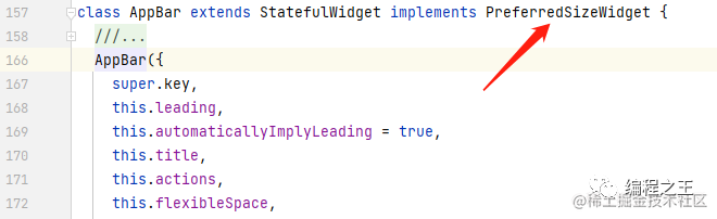
说起 AppBar 组件,大家都比较熟悉,默认情况下是一个 Material 风格的头部标题栏。可能有人疑惑,这么简单的东西,有什么好说的?其实该组件一些重要的属性很多人都不知道,另外在使用过程中有一些细节,本文将结合使用和源码来详细探讨一下 AppBar 组件。
| Material 2 | Material 3 |
|---|---|
|
|
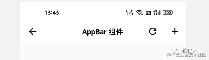
AppBar(title: const Text('AppBar 组件')),AppBar 组件的高度
对于 AppBar 来说,最重要的莫过于它的高度,那它的高度是如何确定的呢?这就不得不说 PreferredSizeWidget 一族的组件了。如下可见,它实现了 PreferredSizeWidget 类:
如下所示,PreferredSizeWidget 是一个抽象类,其中定义了 preferredSize 抽象 get 方法,返回 Size 对象。也就是说该族的组件是需要预先设定尺寸的:
abstract class PreferredSizeWidget implements Widget {Size get preferredSize;}
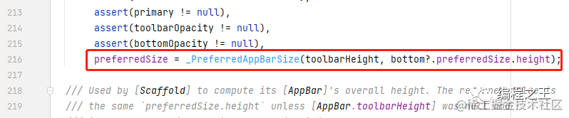
所以 AppBar 既然实现 PreferredSizeWidget,就必然实现 preferredSize 方法,返回尺寸。所以根据这个线索可以知道高度是如何确定的: AppBar 中定义了 preferredSize 成员,所以抽象的 get 方法,将获取该成员:
在 AppBar 构造方法中,preferredSize 被赋值为 _PreferredAppBarSize 对象,其中有两个入参: toolbarHeight,和 bottom 的高度。
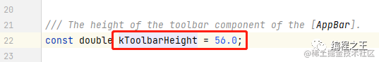
---->[AppBar]----final Size preferredSize;---->[_PreferredAppBarSize]----class _PreferredAppBarSize extends Size {_PreferredAppBarSize(this.toolbarHeight, this.bottomHeight): super.fromHeight((toolbarHeight ?? kToolbarHeight) + (bottomHeight ?? 0));final double? toolbarHeight;final double? bottomHeight;}---->[Size#fromHeight]----const Size.fromHeight(double height) : super(double.infinity, height);
---->[AppBar]----final PreferredSizeWidget? bottom;final double? toolbarHeight;
另外,可以通过参数指定 toolbarHeight 的值,如下是 40 的效果,可以看出标题的高度变小,但并不会影响 bottom。
AppBar(title: const Text('AppBar 组件'),toolbarHeight: 40,),
关于 AppBar 的高度需要注意的就是这些,一般来说 AppBar 作为 Scaffold#appBar 属性的钦定组件使用,不会在外界单独使用。
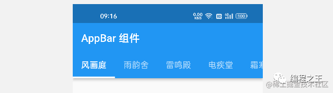
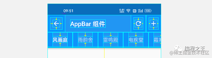
AppBar 组件的部位
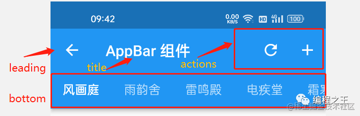
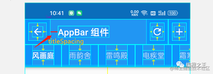
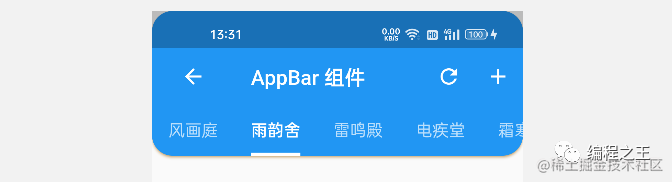
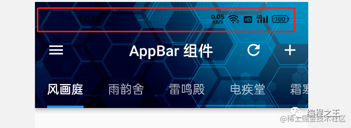
一个普通的 AppBar 可以包含如下四个部位,leading 是左侧组件,title 是中间组件,actions 的右侧组件列表。bottom 是底部组件:
---->[AppBar]----final PreferredSizeWidget? bottom;final Widget? leading;final Widget? title;final List<Widget>? actions;
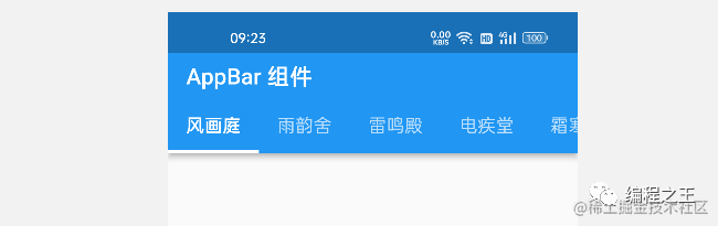
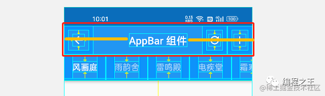
通过查看布局效果可以更清晰地看出 AppBar 各部位的占位情况,
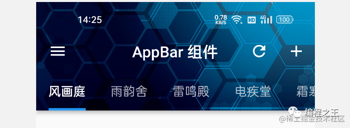
另外,还有一个 Widlget 类型的 flexibleSpace 属性,在源码实现的过程中,该组件将通过 Stack 叠放在 AppBar 下方。效果如下,如果普通的 AppBar 底部用贴图的需求,可以使用这个属性:
[AppBar]----final Widget? flexibleSpace;
部位相关控制属性
下面介绍一些关于部位的属性: centerTitle 是一个 bool 值,可以控制 title 是否居中显示。这个是在整体的居中,所以 AppBar 的标题栏并不是一个简单的 Row 组件包裹,具体地实现细节,将在源码分析中介绍:
[AppBar]----final bool? centerTitle;
toolbarOpacity 和 bottomOpacity 分别用来控制标题栏和底栏的透明度,取值范围是 [0 ~ 1],默认是 1 不透明。一般来说很少有这种需求,了解一下即可:
---->[AppBar]----final double? toolbarOpacity;final double? bottomOpacity;
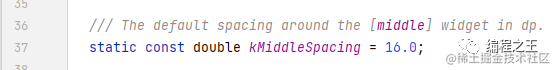
titleSpacing 是一个 double 值,用于控制标题栏和区域左侧的间隔,默认情况下根据 Material 的风格有一定的空间,该值为 16:
final double? titleSpacing;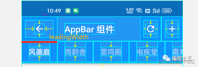
final double? leadingWidth;AppBar 样式属性
可以通过 shape 属性设置 AppBar 形状,如下是通过 RoundedRectangleBorder 设置的圆角矩形。另外 elevation 和 shadowColor 分别表示阴影的深度和阴影颜色:
| 参数 | 类型 | 描述 |
|---|---|---|
| shadowColor | Color? | 阴影颜色 |
| elevation | double | 影深 |
| shape | ShapeBorder? | 形状 |
| 参数 | 类型 | 描述 |
|---|---|---|
| backgroundColor | Color? | 背景色 |
| iconTheme | IconThemeData? | 图标样式 |
| actionsIconTheme | IconThemeData? | 右侧图标样式 |
| titleTextStyle | TextStyle? | 标题文字样式 |
| toolbarTextStyle | TextStyle? | 工具条文字样式 |
AppBar(title: const Text('AppBar 组件'),leading: BackButton(),elevation: 0,backgroundColor: Colors.white,centerTitle: true,iconTheme: IconThemeData(color: Colors.black),titleTextStyle: TextStyle(color: Colors.black,fontSize: 16,fontWeight: FontWeight.bold),actions: [IconButton(onPressed: (){}, icon: Icon(Icons.refresh)),IconButton(onPressed: (){}, icon: Icon(Icons.add)),],),
AppBar 的使用细节
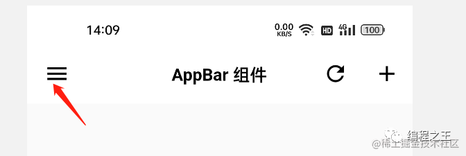
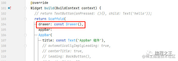
AppBar 在构造时可以传入 automaticallyImplyLeading 属性,用于控制是否在 leading 为 null 时,根据场景自动添加某些图标: 比如 Scafflod 中 drawer 属性非空时,会自动提供 leading,点击时响应事件打开 drawer。
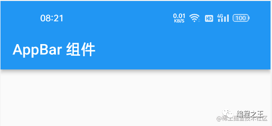
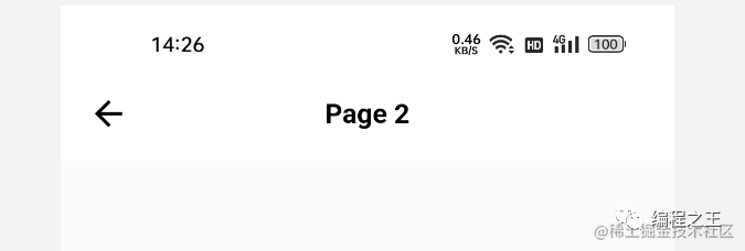
在 AppBar 的使用过程中,有一个非常重要,可能很少人注意的一点: AppBar 的背景色可以影响顶部状态栏的颜色。比如默认情况下背景色是蓝色,状态栏是白色:
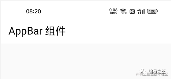
如果背景色是白色,状态栏就会是黑色,这样就很方便。
如果不使用 AppBar,也能界面跳着跳着状态栏就错乱了。比如类似下面的情况。通过源码可以知道 AppBar 中会通过 AnnotatedRegion 维护状态栏的颜色。
如果状态栏的颜色和您预期的不同,可以通过 systemOverlayStyle 属性来设置状态栏的颜色,如下 light 会将状态栏图标的颜色变白:
systemOverlayStyle: const SystemUiOverlayStyle(statusBarIconBrightness:Brightness.light),
长按右侧二维码
查看更多开发者精彩分享

"开发者说·DTalk" 面向
 点击屏末 |
阅
读
原
文
| 即刻报名参与 "开发者说·DTalk"
点击屏末 |
阅
读
原
文
| 即刻报名参与 "开发者说·DTalk"


相关内容


 微信扫码咨询专知VIP会员