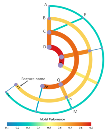
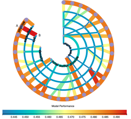
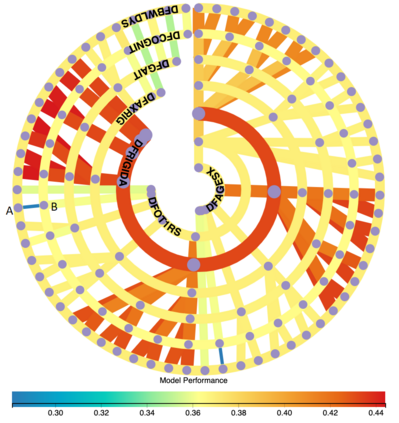
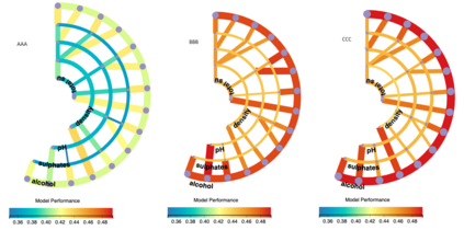
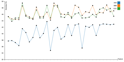
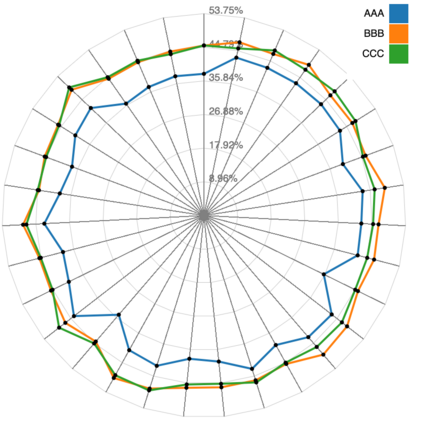
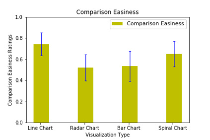
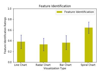
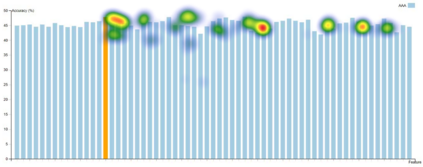
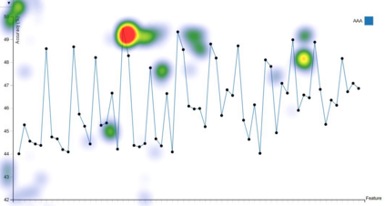
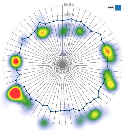
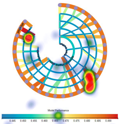
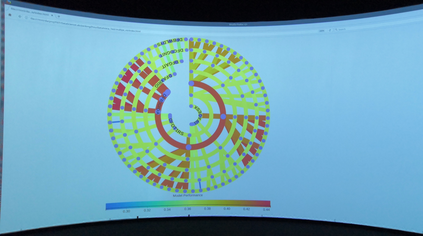
Building an effective Machine Learning (ML) model for a data set is a difficult task involving various steps. One of the most important steps is to compare generated substantial amounts of ML models to find the optimal one for the deployment. It is challenging to compare such models with dynamic number of features. Comparison is more than just finding differences of ML model performance, users are also interested in the relations between features and model performance such as feature importance for ML explanations. This paper proposes RadialNet Chart, a novel visualisation approach to compare ML models trained with a different number of features of a given data set while revealing implicit dependent relations. In RadialNet Chart, ML models and features are represented by lines and arcs respectively. These lines are generated effectively using a recursive function. The dependence of ML models with dynamic number of features is encoded into the structure of visualisation, where ML models and their dependent features are directly revealed from related line connections. ML model performance information is encoded with colour and line width in RadialNet Chart. Together with the structure of visualisation, feature importance can be directly discerned in RadialNet Chart for ML explanations.
翻译:为数据集建立一个有效的机器学习模型是一项涉及不同步骤的艰巨任务。 最重要的步骤之一是比较生成的大量ML模型,以找到最佳的部署模式。 将这些模型与动态特性数进行比较是困难的。 比较不仅仅是发现ML模型性能的差异,用户还关心特性和模型性能之间的关系,例如ML解释的特性重要性。 本文提议了RadialNet Chart, 这是一种新颖的可视化方法,将经过培训的ML模型与特定数据集的不同特性进行比较,同时揭示隐含的依附关系。 在RadialNet图中, ML模型和特征分别由线和弧分别代表。 这些线是使用循环函数有效生成的。 具有动态特性数的ML模型的依附性被纳入了可视化结构, 其中ML模型及其依附特征直接从相关线连接中揭示。 ML 与彩色和线宽于RadialNet图中的显示性能信息, 连同可视化结构, 特征重要性可以在RadialNet图表中直接识别。


