微课|ggplot2:条形图
ROBLEM
今日问题
使用ggplot2绘制条形图图.
条形图排序.
给条形图添加标签.
scale_XX_XX系列使用方法.
一些常用主题模块介绍.
绘制多变量条形图.
绘制具有误差条的条形图
这次微课使用base数据集中ToothGrowth,为便于讨论数据集被构造成df,df2与df3三个数据框.其中df用来绘制基本条形图,df2用来绘制分组条形图,df3用来绘制具有误差条的条形图.
#使用到R包
library(ggplot2)library(plyr)
#数据集一
df <- data.frame(dose=c("D0.5", "D1", "D2"),
                 len=c(10, 4.2, 29.5))
head(df)
#********************************************************************
#数据集二
df2 <- data.frame(supp=rep(c("VC", "OJ"), each=3),
                  dose=rep(c("D0.5", "D1", "D2"),2),
                  len=c(6.8, 15, 33, 4.2, 10, 29.5))
head(df2)
#*********************************************************************
#数据集三
data_summary <- function(data, varname, groupnames)
{  require(plyr)
  summary_func <- function(x, col){
    c(mean = mean(x[[col]], na.rm=TRUE),
      sd = sd(x[[col]], na.rm=TRUE))
  }
  data_sum<-ddply(data, groupnames, .fun=summary_func, varname)
  data_sum <- rename(data_sum, c("mean" = varname))  return(data_sum)
}

df3 <- data_summary(ToothGrowth, varname="len",
                    groupnames=c("supp", "dose"))
df3$dose=as.factor(df3$dose)
head(df3)绘制条形图的基方法是ggplot(…)+geon_bar(…),具体看下面代码块及图形
#创建画板
f <- ggplot(df, aes(x = dose, y = len))
#基本条形图
f + geom_bar(stat = "identity")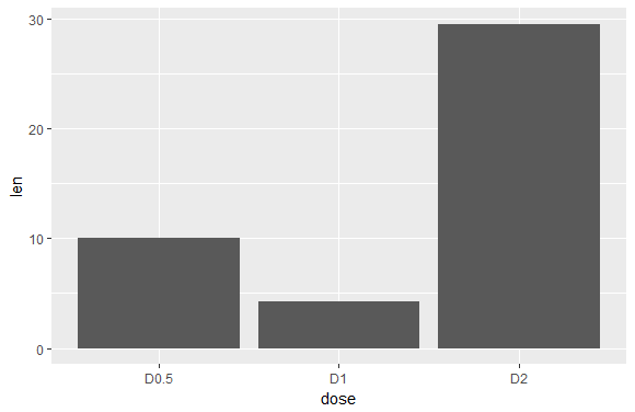
条形图排序使用reorder(Var1, Var2),其中Var1为字符型变量,Var2为数值型变量.默认为升序,若使用降序排列只需修改为reorder(Var1, -Var2)
f <- ggplot(df,aes(reorder(dose,len),y=len))
f + geom_bar(stat = "identity")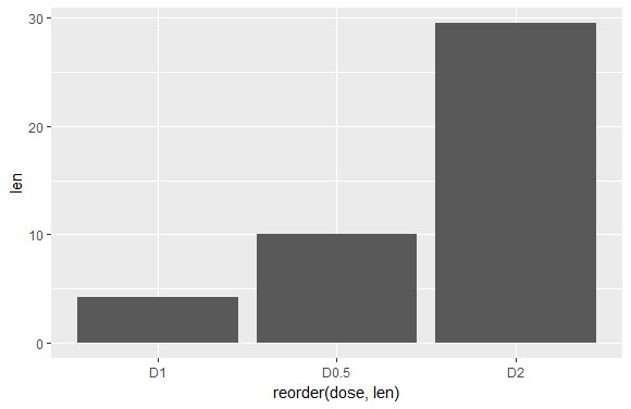
使用geom_text()函数添加标签,然后通过vjust对标签微调,在使用colour,sizede等自定义标签.
f + geom_bar(stat="identity", fill="steelblue",colour='white')+
  geom_text(aes(label=len), vjust=1.6, color="white", size=3.5)+
  theme_minimal()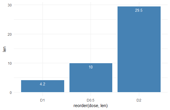
我想通过这个例子来说明scale_XXX_XXX系列函数. 在下面代码块的第一行,我们将dose映射给了填充色参数fill,下面我们通过scale_fill_XXX来改变填充色.主要有三种scale_fill_manual自定义颜色;scale_fill_brewer调用RColorBrewer包调色板;scale_fill_grey使用ggplot2包自带的灰色调色板.最后使用的theme_minimal()是ggplot2封装的一个主题,称为最简主题,此外还有theme_gray, theme_classic, theme_bw, theme_light 等9个主题.有兴趣的同学也可以使用ggplot2的扩展包ggthemes,提供了经济学人,华尔街日报,google,EXCEL等14个主题.
f + geom_bar(aes(fill = dose), stat="identity") +
  #scale_fill_manual(values = c("#999999", "#E69F00", "#56B4E9"))+
  #scale_fill_brewer(palette="Dark2")+
  scale_fill_grey()+
  theme_minimal()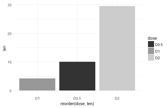
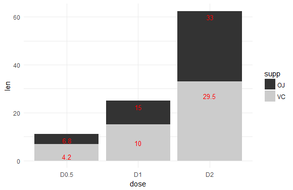
多变量条形图中主要使用的是并列条形图和堆叠条形图, 并列条形图为默认的方式,堆叠条形图需要自定义数据类型,另外堆叠条形图标签的添加也需要一些简单的数学运算,具体过程见下面代码块.
#并列条形图
ggplot(data=df2, aes(x=dose, y=len, fill=supp)) +
  geom_bar(stat="identity", position = position_dodge())+
   scale_fill_grey()+
  geom_text(aes(label = len), vjust = 1.6, color = "red",
            position = position_dodge(0.9), size = 3.5)+
  theme_minimal()
#*************************************************************
#堆叠条形图
#按剂量和注射方式对df分组
df_sorted <- arrange(df2, dose, supp)
head(df_sorted)
#自定义函数
fun=function(x){
  tol=cumsum(x)
  re=(tol-c(0,tol[-length(tol)]))/2+c(0,tol[-length(tol)])  return(re)
}
df_cumsum <- ddply(df_sorted, "dose", transform,
                   label_ypos=cumsum(len))
head(df_cumsum)
ggplot(data=df_cumsum, aes(x = dose, y = len, fill = supp)) +
  geom_bar(stat = "identity")+
  scale_fill_grey()+
  geom_text(aes(y = label_ypos, label = len), vjust=1.6,
            color = "red", size = 3.5)+
  theme_minimal()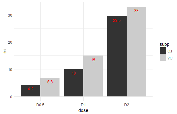
使用geom_errorbar()函数给条形图添加误差条,关键是数据集的构造,具体过程大家可以参照df3的狗造过程以及下面的代码块
p <- ggplot(df3, aes(x=dose, y=len, fill=supp)) +
  geom_bar(stat="identity", position=position_dodge()) +
  geom_errorbar(aes(ymin=len-sd, ymax=len+sd), width=.2,
                position=position_dodge(.9),colour='red')
p + labs(title="添加误差条",caption='@数萃大数据',
         x="剂量 (mg)", y = "长度")+
  scale_fill_manual(values=c('gray20','lightgray'))+
  theme_minimal()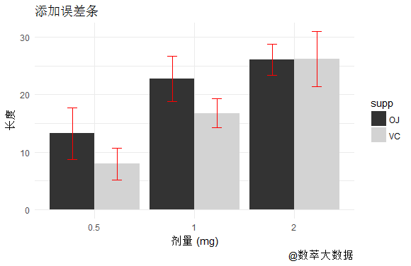
推荐阅读
更多微课请关注【数萃大数据】公众号,点击学习园地—可视化


欢迎大家关注微信公众号:数萃大数据

python大数据分析培训班【杭州站】
时间:2017年8月18日-22日
地点:杭州亚朵吴酒店
更多详情,请扫描下面二维码

网络爬虫与文本挖掘培训班【宁波站】
时间:2017年9月23日-25日
地点:维也纳国际酒店(机场店)
更多详情,请扫描下面二维码