2020不容错过!24个CSS新特性来了
阿里妹导读:@argyleink在第四次伦敦CSS活动(LondonCSS 2020)[1]中分享了一个有关于CSS特性相关的话题。本文基于该PPT,整理了近24个CSS方面的新特性,分为Web动效 、Web排版 、Web性能 、 Web可访问性 、 Web美化和其他等六个部分,通过代码实例进行详细介绍。多图长文,同学们可收藏后再看。

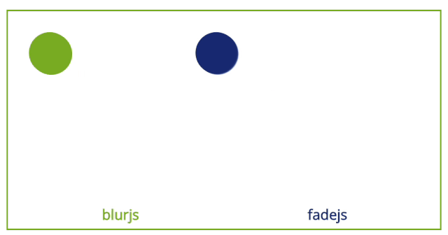
.animated-layer {/* GPU加速动画 */animation: rotate .5s linear infinite;/* 向引擎请求动态模糊* motion-rendering可以接受inherit | initial | auto | none | blur 值*/motion-rendering: blur;/* 类似于相机的快门,指的是快门角度,用来控制模糊量或模糊强度* motion-shutter-angle可受任意角度值 inherit | initial | auto = 180deg | [0deg, ..., 720deg]*/motion-shutter-angle: 180deg;}@keyframes rotate {to {transform: rotate(1turn);}}
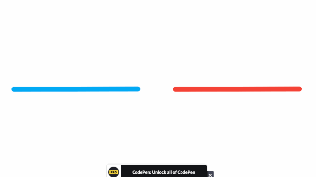
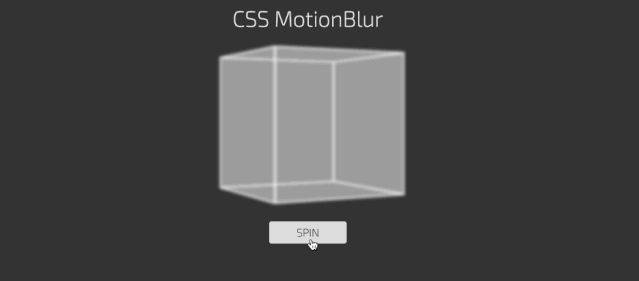
.blur {animation: blur 250ms;}@keyframes blur {0% {-webkit-filter: blur(0px);}50% {-webkit-filter: blur(5px);}100% {-webkit-filter: blur(0px);}}
filter: motion-blur(5px) motion-squash(2px)// 或transform-fiilter: motion-blur(180deg)// 或transition-filter: motion-blur(180deg)
SVG 1.1: Filter Effects[4]
SVG Filters 101[5]
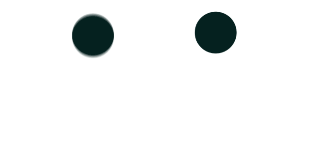
Trust is Good, Observation is Better—Intersection Observer v2
How to do scroll-linked animations the right way
@scroll-timeline = @scroll-timeline <timeline-name> { <declaration-list> }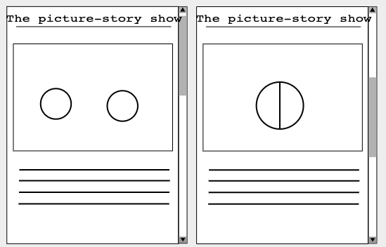
@media (prefers-reduced-motion: no-preference) {div.circle {animation-duration: 1s;animation-timing-function: linear;animation-timeline: collision-timeline;}#left-circle {animation-name: left-circle;}#right-circle {animation-name: right-circle;}#union-circle {animation-name: union-circle;animation-fill-mode: forwards;animation-timeline: union-timeline;}@scroll-timeline collision-timeline {source: selector(#container);orientation: block;start: 200px;end: 300px;}@scroll-timeline union-timeline {source: selector(#container);orientation: block;start: 250px;end: 300px;}@keyframes left-circle {to { transform: translate(300px) }}@keyframes right-circle {to { transform: translate(350px) }}@keyframes union-circle {to { opacity: 1 }}}
if (window.matchMedia('(prefers-reduced-motion: no-preference)').matches) {const scrollableElement = document.querySelector('#container');const collisionTimeline = new ScrollTimeline({source: scrollableElement,start: CSS.px(200),end: CSS.px(300)});const left = leftCircle.animate({ transform: 'translate(300px)' }, 1000);left.timeline = collisionTimeline;const right = leftCircle.animate({ transform: 'translate(350px)' }, 1000);right.timeline = collisionTimeline;const union = unionCircle.animate({ opacity: 1 }, { duration: 1000, fill: "forwards" });union.timeline = new ScrollTimeline({source: scrollableElement,start: CSS.px(250),end: CSS.px(300)});}
@media (prefers-reduced-motion: no-preference) {@scroll-timeline progress-timeline {source: selector(#body);start: 0;end: 100%;}@keyframes progress {to { width: 100%; }}#progress {width: 0px;height: 30px;background: red;animation: 1s linear forwards progress progress-timeline;}}
if (window.matchMedia('(prefers-reduced-motion: no-preference)').matches) {var animation = div.animate({ width: '100%' }, { duration: 1000, fill: "forwards" });animation.timeline = new ScrollTimeline({start: 0,end: CSS.percent(100)});}
import 'https://flackr.github.io/scroll-timeline/dist/scroll-timeline.js'const counter = document.querySelector('main')const slashes = document.querySelectorAll('.slash')slashes.forEach(slash => {slash.animate({transform: ['rotateZ(0)','rotateZ(4turn)']},{duration: 1000,fill: 'both',timeline: new ScrollTimeline({scrollSource: counter,fill: 'both',}),})})
<!-- HTML --><div class="grid"><div class="item"><div class="subitem"></div></div></div>/* CSS */.grid {display: grid;grid-template-columns: repeat(9, 1fr);grid-template-rows: repeat(4, minmax(100px, auto));}.item {grid-column: 2 / 7;grid-row: 2 / 4;display: grid;grid-template-columns: repeat(3, 1fr);grid-template-rows: repeat(3, 80px);}.subitem {grid-column: 2 / 4;grid-row: 1 / 4;}
.grid {display: grid;grid-template-columns: repeat(9, 1fr);grid-template-rows: repeat(4, minmax(100px, auto));}.item {grid-column: 2 / 7;grid-rows: 2 / 4;display: grid;grid-template-columns: subgrid;grid-template-rows: subgrid;}.subitem {grid-column: 3 / 6;grid-row: 1 / 4;}
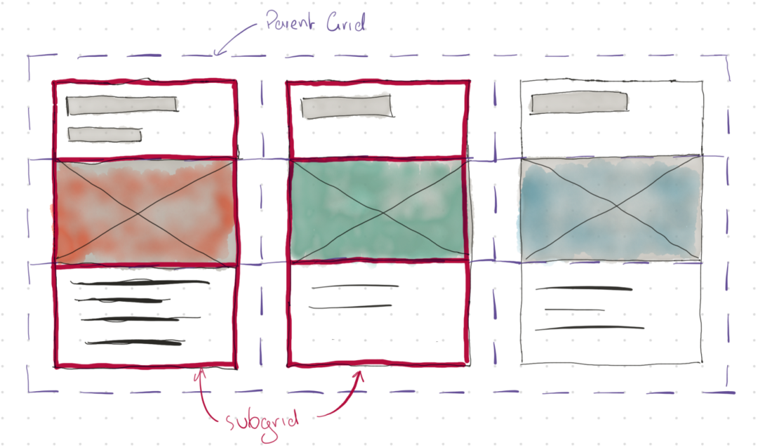
CSS Grid Layout Module Level 2: subgrid
Hello subgrid!
CSS Grid Level 2: Here Comes Subgrid
MDN: Subgrid
Irregular-shaped Links with Subgrid

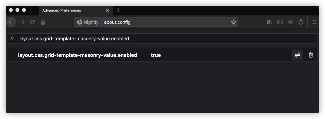
.masonry {display: grid;gap: 20px;grid: masonry / repeat(auto-fill, minmax(250px, 1fr));}
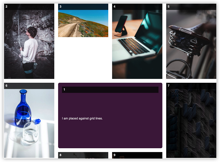

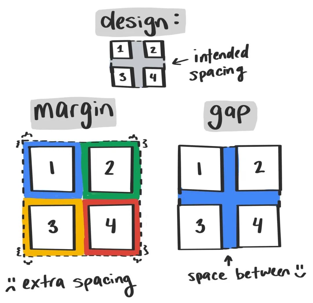
body {column-gap: 35px;}
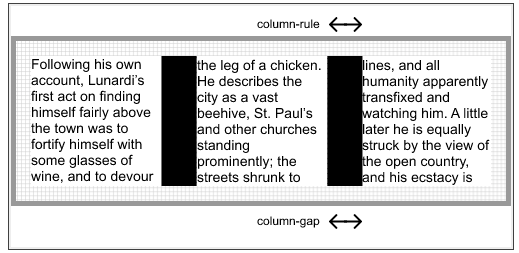
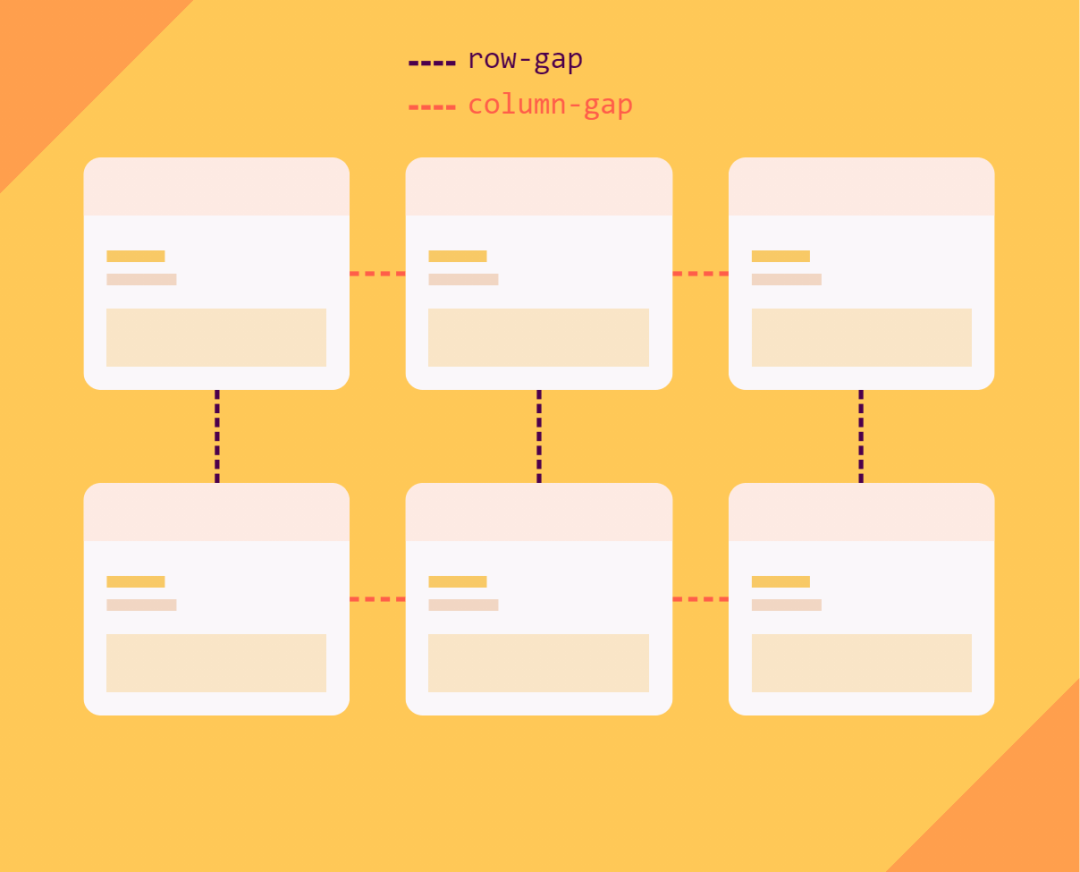
多列布局{gap: 5ch}Flexbox布局{display: flex;gap: 20px}Grid布局{display: grid;gap: 10vh 20%}
.gap {gap: 10px;}// 等同于.gap {row-gap: 10px;column-gap: 10px}.gap {gap: 20px 30px;}// 等同于.gap {row-gap: 20px;column-gap: 30px;}
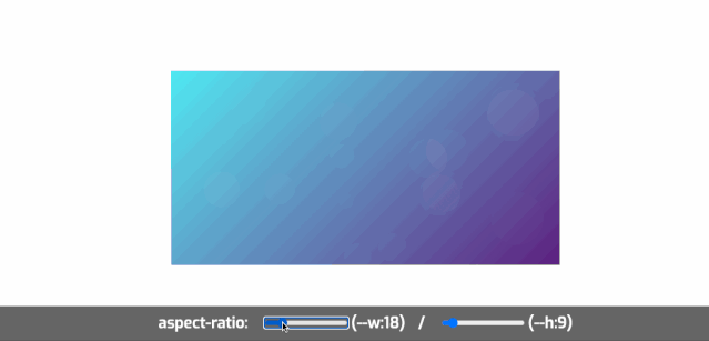
.aspectration {position: relative;/*因为容器所有子元素需要绝对定位*/height: 0; /*容器高度是由padding来控制,盒模型原理告诉你一切*/width: 100%;}.aspectration[data-ratio="16:9"] {padding-top: 56.25%;}.aspectration[data-ratio="4:3"]{padding-top: 75%;}
div {aspect-ratio: 1 / 1;}
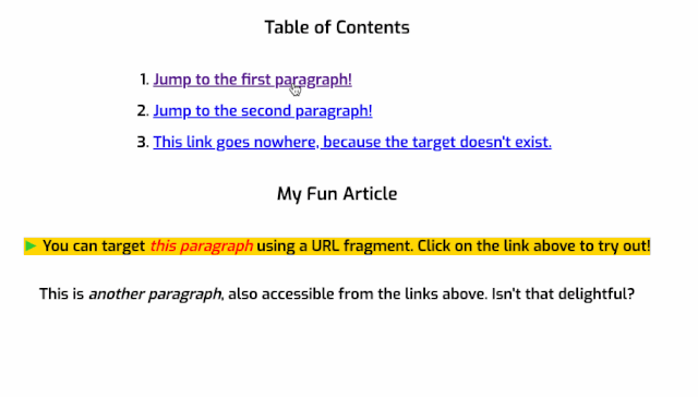
<!-- HTML --><h3>Table of Contents</h3><ol><li><a href="#p1">Jump to the first paragraph!</a></li><li><a href="#p2">Jump to the second paragraph!</a></li><li><a href="#nowhere">This link goes nowhere, because the target doesn't exist.</a></li></ol><h3>My Fun Article</h3><p id="p1">You can target <i>this paragraph</i> using a URL fragment. Click on the link above to try out!</p><p id="p2">This is <i>another paragraph</i>, also accessible from the links above. Isn't that delightful?</p>/* CSS */p:target {background-color: gold;}/* 在目标元素中增加一个伪元素*/p:target::before {font: 70% sans-serif;content: "►";color: limegreen;margin-right: .25em;}/*在目标元素中使用italic样式*/p:target i {color: red;}
article:target-within {background-color: hsl(var(--surfaceHSL) / 10%);}
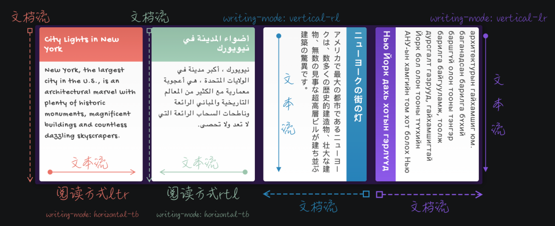
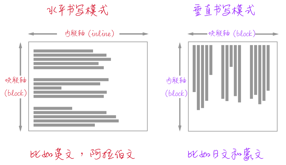
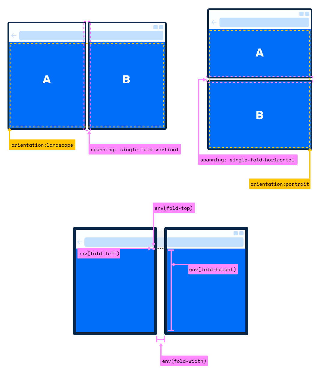
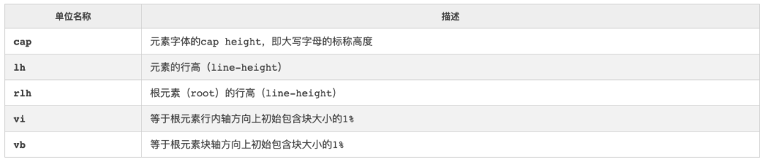
块轴:主要定义网站文档(元素块)流,CSS的书写模式writing-mode会影响块轴的方向。
内联轴:主要定义网站的文本流方向,也就是文本的阅读方式,CSS的direction或HTML的dir会影响内联轴的方向。
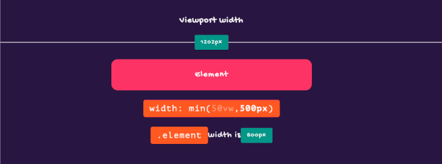
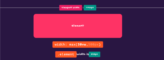
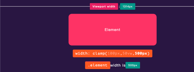
如果VAL在MIN和MAX之间,则使用VAL作为函数的返回值;
如果VAL大于MAX,则使用MAX作为函数的返回值;
如果VAL小于MIN,则使用MIN作为函数的返回值。
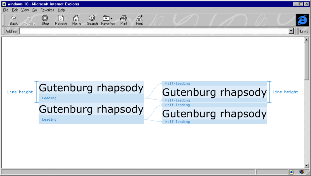
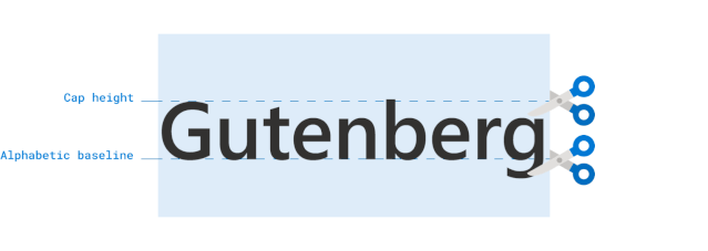
h1 {leading-trim: both;text-edge: cap alphabetic;}
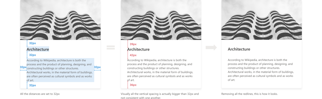
注意,leading-trim只影响文本框,它不会切断其中的文字。
text-edge: leading | [ text | cap | ex | ideographic | ideographic-ink ] [ text | alphabetic | ideographic | ideographic-ink ]?leading-trim: normal | start | end | both
The Thing With Leading in CSS
Leading-Trim: The Future of Digital Typesetting
Rethinking line-sizing and leading-trim
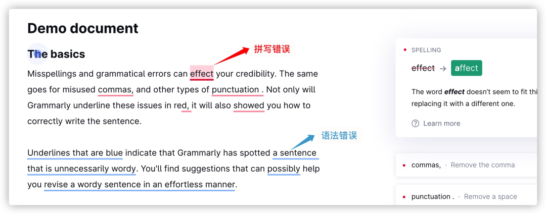
::grammar-error:浏览器为语法错误的文本段添加样式。
::spelling-error:浏览器为拼写错误的文本段添加样式。
:root::spelling-error {text-decoration: spelling-error;}:root::grammar-error {text-decoration: grammar-error;}[spellcheck]::spelling-error {text-decoration: wavy underline var(--neon-red);}[grammarcheck]::grammar-error {text-decoration: wavy underline var(--neon-blue);}
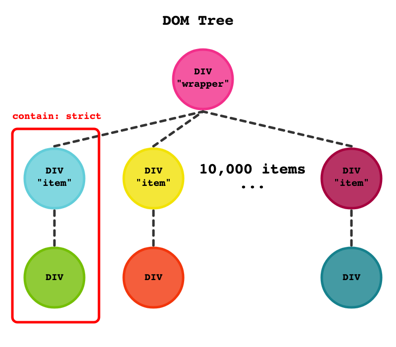
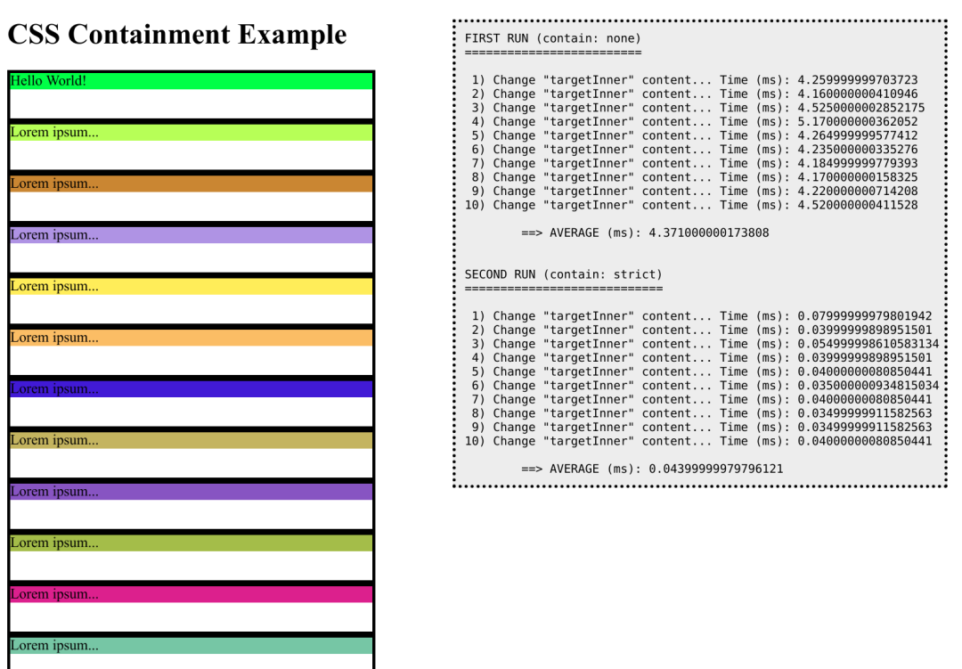
<div class="item"><div>Lorem ipsum...</div></div>
const NUM_ITEMS = 10000;const NUM_REPETITIONS = 10;function log(text) {let log = document.getElementById("log");log.textContent += text;}function changeTargetContent() {log("Change \"targetInner\" content...");// Force layout.document.body.offsetLeft;let start = window.performance.now();let targetInner = document.getElementById("targetInner");targetInner.textContent = targetInner.textContent == "Hello World!" ? "BYE" : "Hello World!";// Force layout.document.body.offsetLeft;let end = window.performance.now();let time = window.performance.now() - start; log(" Time (ms): " + time + "\n");return time;}function setup() {for (let i = 0; i < NUM_ITEMS; i++) {let item = document.createElement("div");item.classList.add("item");let inner = document.createElement("div");inner.style.backgroundColor = "#" + Math.random().toString(16).slice(-6);inner.textContent = "Lorem ipsum...";item.appendChild(inner);wrapper.appendChild(item);}}
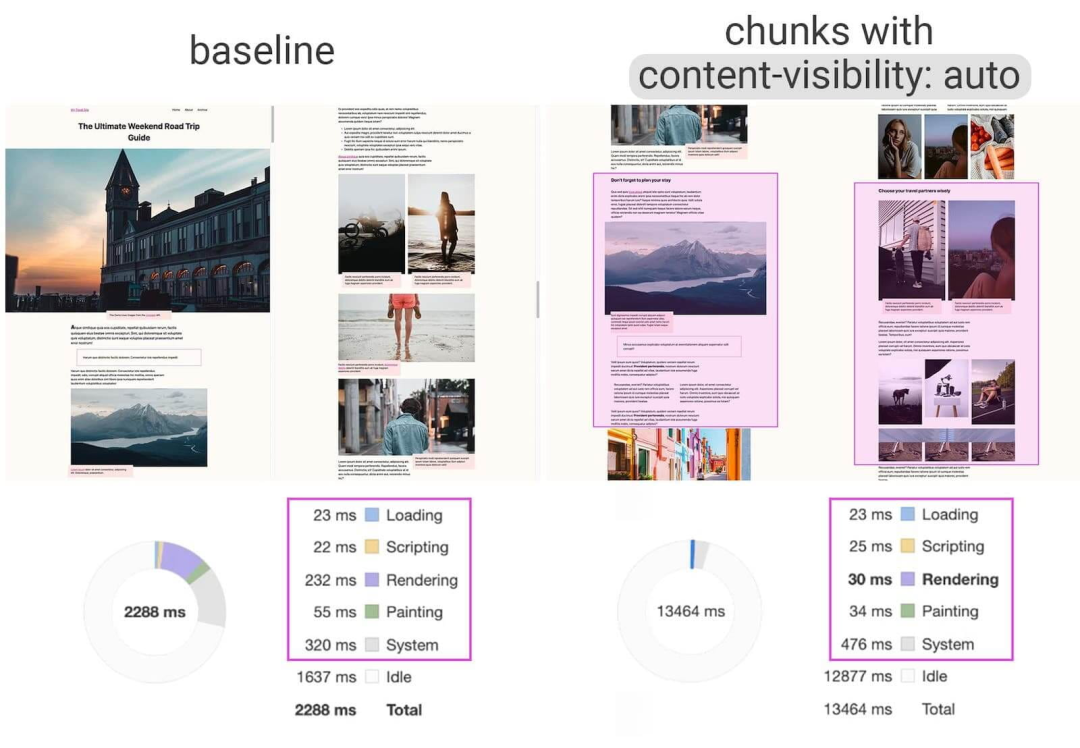
CSS Containment in Chrome 52
Helping Browsers Optimize With The CSS Contain Property
An introduction to CSS Containment
Let’s Take a Deep Dive Into the CSS Contain Property
CSS Containment
content-visibility: the new CSS property that boosts your rendering performance
Short note on content-visibility: hidden
Using content-visibility: hidden
Using content-visibility: auto
@media (prefers-reduced-data: reduce) {header {background-image: url(/grunge.avif);}}
@media (hover: hoveer) {}@media (hover: none) and (pointer: coarse) {}@media (hover: none) and (pointer: fine) {}@media print and (min-resolution: 300dpi) {}@media (scan: interlace) {}@media (update) {}@media(environment-blending: additive){}@media (color) {}
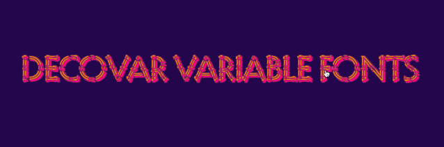
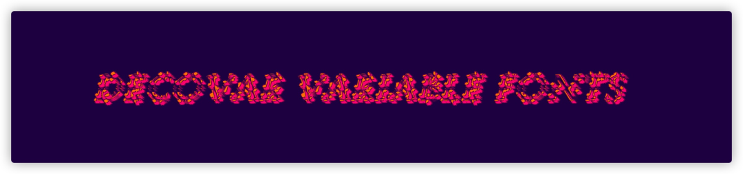
.text {font-weight: 800;font-style: italic;font-variation-settings: "SSTR" 183, "INLN" 648, "TSHR" 460, "TRSB" 312, "TWRM" 638, "SINL" 557, "TOIL" 333, "TINL" 526, "WORM" 523;transition: font-variation-settings .28s ease;}.text:hover {font-weight: 400;font-style: normal;font-variation-settings: "SSTR" 283, "INLN" 248, "TSHR" 160, "TRSB" 112, "TWRM" 338, "SINL" 257, "TOIL" 133, "TINL" 426, "WORM" 223;}

p {font-size: 60px;line-height: 37px;letter-spacing: 0.113em;font-variation-settings: "SSTR" 450, "INLN" 741, "TSHR" 292, "TRSB" 497, "TWRM" 173, "SINL" 557, "TOIL" 728, "TINL" 526, "WORM" 523, "TFLR" 362, "TRND" 516, "SWRM" 536, "TSLB" 509;font-weight: 491;}
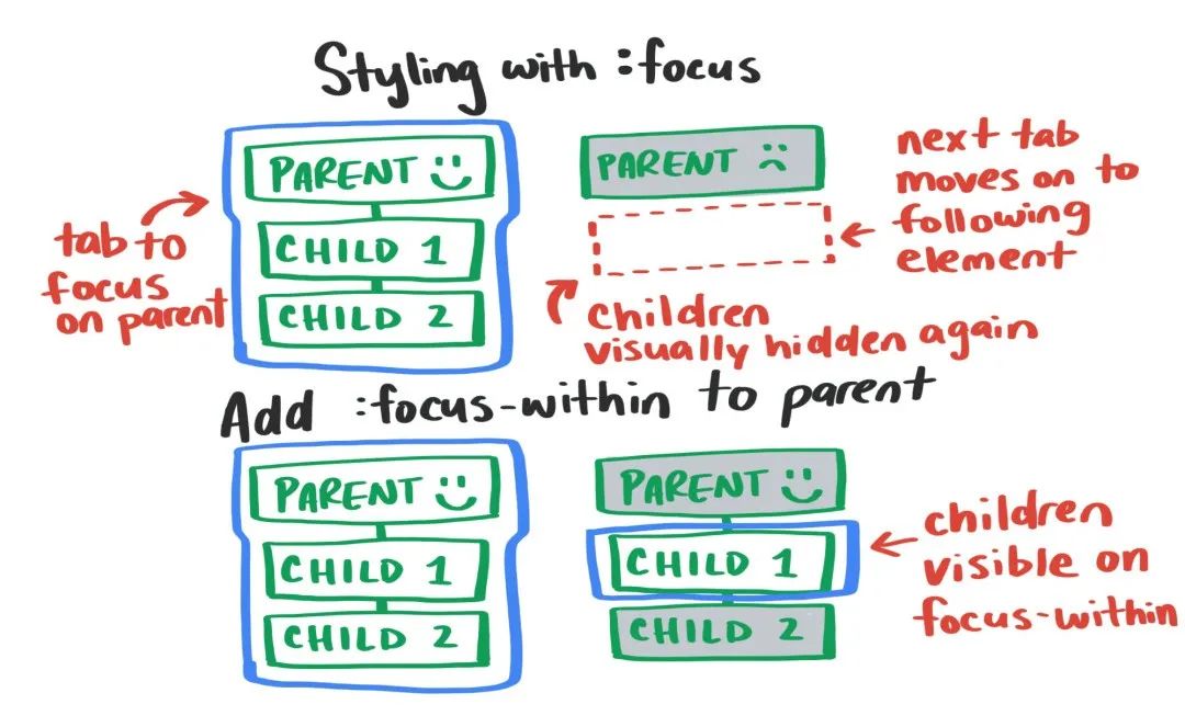
form:focus-within {box-shadow: 0px 0.2em 2.5em #c4c4c4;transform: scale(1.025);}
/* 链接得到焦点时的样式 */a:focus {}/** 1. 如果链接有焦点,但是浏览器通常不会显示默认的焦点样式,会覆盖上面的焦点样式* 2. 不是按键盘`tab`键让链接得到的焦点,比如说鼠标点击链接*/a:focus:not(:focus-visible) {}/* 按键盘tab键让链接得到焦点的样式 */a:focus-visible {}

<hwb()> :HWB(白色-白色-黑色的缩写)是另一种指定颜色的方法,类似于HSL,它描述了一开始的色调,然后是一定程度的白色和黑色混合到基本色调
<lab()>和<lch()> :Lab是由一个亮度通道和两个颜色通道组成的。在Lab颜色空间中,每个颜色用L(亮度)、a(从绿色到红色的分量)和b(从蓝色到黄色的分量)三个数字表示。而Lch分别表示了颜色的亮度、饱和度和色调
<gray()> :灰色是完全去饱和的颜色,gray()函数表示法简化了对这组常见颜色的指定,因此只需要一个数值参数,用来指定颜色的灰度
<color()> :该函数允许在特定的颜色空间中指定颜色
<device-cmyk()> :该函数是以CMYK(青色、品红、黄色和黑色)组合,在该设备上生成特定的颜色
<system-color> :根据用户操作系统来匹配颜色
color-mix() :该函数接受两个<color>规范,并在给定的颜色空间中以指定的数量返回它们混合的结果
color-contrast() :该函数首先使用一种颜色(通常是背景色),然后使用两种或两种以上颜色的列表,它从该列表中选择亮度对比度最高的颜色到单一颜色
color-adjust() :该函数接受一个<color>规范,并通过指定的转换函数在给定的颜色空间中返回调整该颜色的结果 颜色扩展:根据现有的颜色(在这称为“原始颜色”)在函数的目标颜色空间中生成颜色,它是<rgb()>、<rgba()>、<hsl()>、<hsla()>、<hwb()>、<lab()>和<lch()>的扩展颜色
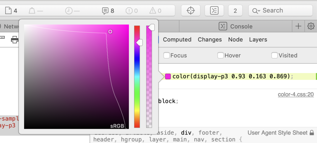
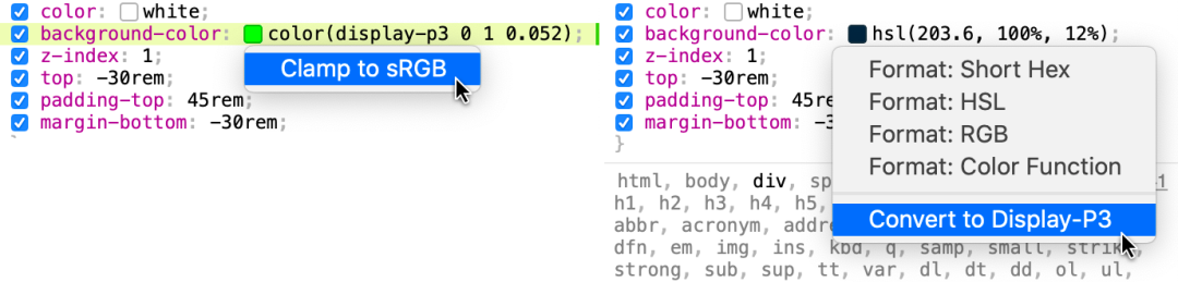
// Color Level 4.colour {--fn-notation: hsl(2rad 50% 50% / 80%);--neon-pink: color(display-p3 1 0 1);--gray: lch(50% 0 0);--fallback: color(lab 25 25 25, display-p3 1 0 1,}// Color Level 5.colour {--pink: color-mix(red, white);--halfpink: color(var(--pink) / 50%);--halfred: rgb(from--darkred: hsl(from red h s calc(l * .25));}
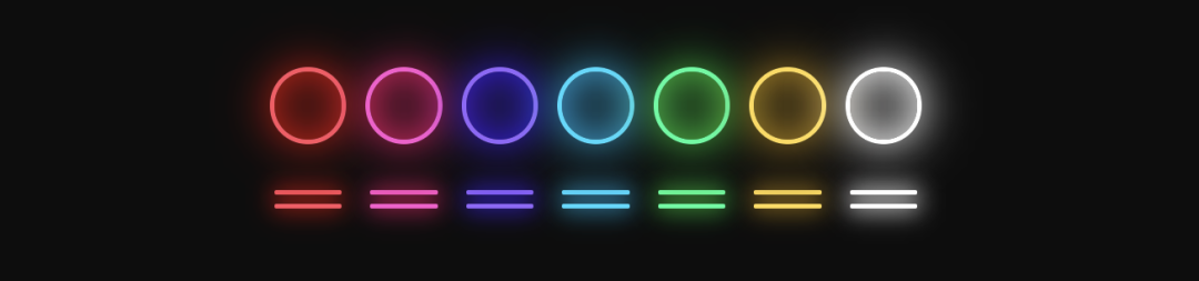
@media (dynamic-range: high) {.neon-red {--neon-glow: color(display-p3 1 0 0);}.neon-pink {--neon-glow: color(display-p3 1 0 1);}.neon-purple {--neon-glow: color(display-p3 0 0 1);}.neon-blue {--neon-glow: color(display-p3 0 1 1);}.neon-green {--neon-glow: color(display-p3 0 1 0);}.neon-yellow {--neon-glow: color(display-p3 1 1 0);}.neon-white {--neon-glow: color(display-p3 1 1 1);}}

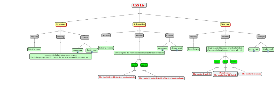
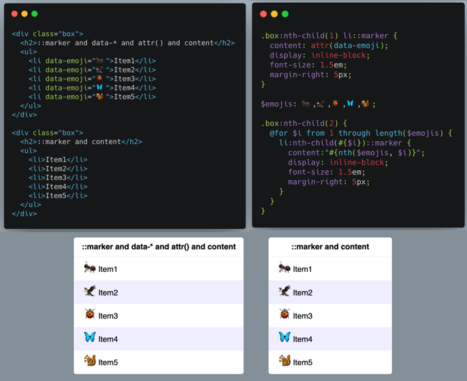
非列表项li元素需要显式的设置display:list-item (内联列表项需要使用display: inline list-item)。
需要显式设置list-style-type为none。
使用content添加内容(也可以通过attr()配合data-*来添加内容)。
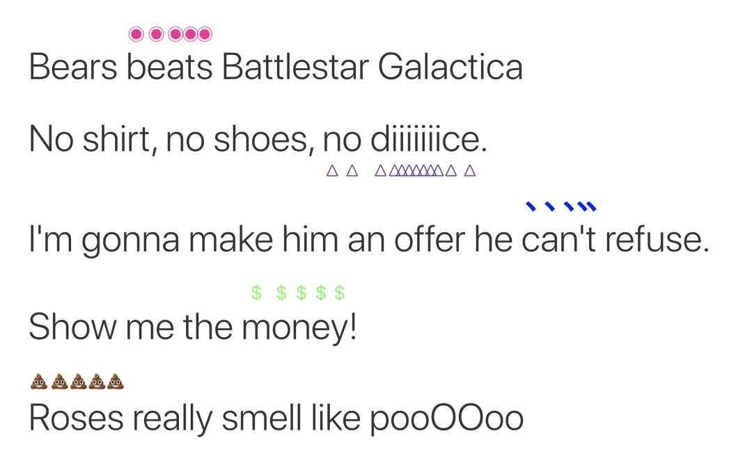
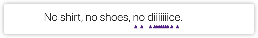
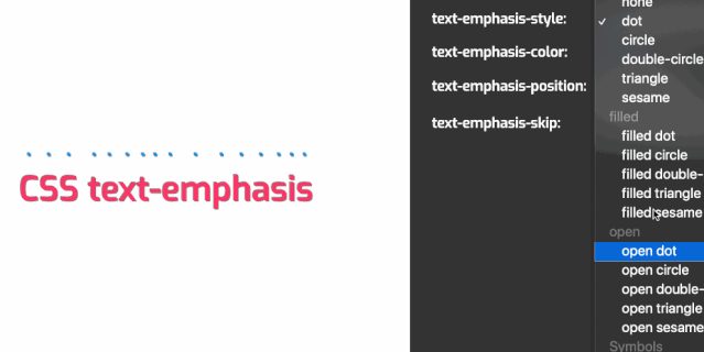
.emphasis {text-emphasis: triangle rebeccapurple;text-emphasis-position: under;}
:root {--color: #fff;--color-bg: #000;}@media (prefers-color-scheme: dark) {--color: #000;--color-bg: #fff;}body {color: var(--color);background-color: var(--color-bg)}
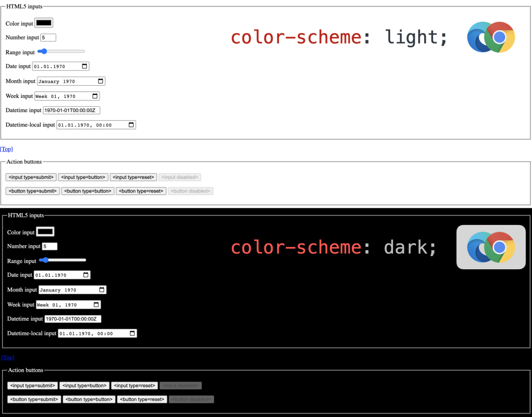
:root {color-scheme: dark light;}
<meta name="color-scheme" content="dark light" />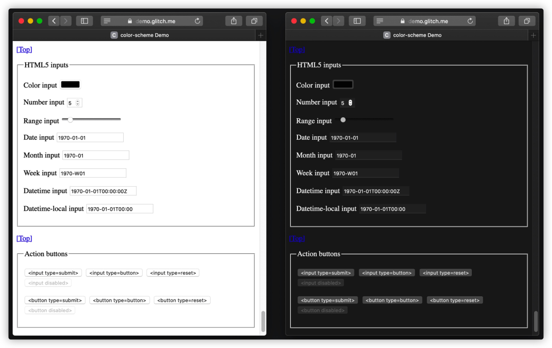
CSS Color Adjustment Module Level 1: color-scheme
Improved dark mode default styling with the color-scheme CSS property and the corresponding meta tag
Don’t Forget the color-scheme Property
.parent {& > .child {color: red;}}.child {.parent & {color: blue;}}
.parent > .child {color: red;}.parent .child {color: blue;}
section {p {color: blue;}}
:is(article, section) p {color: blue;}
article p,section p {color: blue}
section {> p {color: blue;}}
article > p,section > p{color: blue;}
.foo {color: blue;& > .bar {color: red;}}/* 等同于 */.foo {color: blue;}.foo > .bar {color: red;}.foo {color: blue;&.bar {color: red;}}/* 等同于 */.foo {color: blue;}.foo.bar {color: red;}.foo, .bar {color: blue;& + .baz, &.qux {color: red;}}/* 等同于 */.foo, .bar {color: blue;}:is(.foo, .bar) + .baz,:is(.foo, .bar).qux {color: red;}
/* 无效,因为没有嵌套选择器 */{color: red;{color: blue;}}/* 无效,因为&不在第一个复合选择器中 */.foo {color: red;& {color:blue;}}/* 无效,因为列表中的第二个选择器不包含嵌套选择器 */.foo {color: red;.baz {color: blue;}}
.foo {color: red;& > .bar {color: blue;}}/* 等同于 */.foo {color: red;}.foo > .bar {color: blue;}.foo {color: red;.parent & {color: blue;}}/* 等同于 */.foo {color: red;}.parent .foo {color: blue;}.foo {color: red;:not(&) {color: blue;}}/* 等同于 */.foo {color: red;}:not(.foo) {color: blue;}
/* 无效,因为没有嵌套选择器 */.foo {color: red;.bar {color: blue;}}/* 无效,因为不是列表中的所有选择器都包含嵌套选择器 */.foo {color: red;& .bar, .baz {color: blue;}}
CSS.registerProperty({name: '--colorPrimary',syntax: '<color>',initialValue: 'magenta',inherits: false});
.card {background-color: var(--colorPrimary); /* magenta */}.highlight-card {--colorPrimary: yellow;background-color: var(--colorPrimary); /* yellow */}.another-card {--colorPrimary: 23;background-color: var(--colorPrimary); /* magenta */}
@property --gradient-start {syntax: "<color>";initial-value: white;inherits: false;}
.el {--gradient-start: white;background: linear-gradient(var(--gradient-start), black);transition: --gradient-start 1s;}.el:hover {--gradient-start: red;}
:root {--color: #f09}body {color: var(--color)}
:root {--ease-in-quad: cubic-bezier(0.55, 0.085, 0.68, 0.53);--ease-in-cubic: cubic-bezier(0.55, 0.055, 0.675, 0.19);--ease-in-quart: cubic-bezier(0.895, 0.03, 0.685, 0.22);--ease-in-quint: cubic-bezier(0.755, 0.05, 0.855, 0.06);--ease-in-expo: cubic-bezier(0.95, 0.05, 0.795, 0.035);--ease-in-circ: cubic-bezier(0.6, 0.04, 0.98, 0.335);--ease-out-quad: cubic-bezier(0.25, 0.46, 0.45, 0.94);--ease-out-cubic: cubic-bezier(0.215, 0.61, 0.355, 1);--ease-out-quart: cubic-bezier(0.165, 0.84, 0.44, 1);--ease-out-quint: cubic-bezier(0.23, 1, 0.32, 1);--ease-out-expo: cubic-bezier(0.19, 1, 0.22, 1);--ease-out-circ: cubic-bezier(0.075, 0.82, 0.165, 1);--ease-in-out-quad: cubic-bezier(0.455, 0.03, 0.515, 0.955);--ease-in-out-cubic: cubic-bezier(0.645, 0.045, 0.355, 1);--ease-in-out-quart: cubic-bezier(0.77, 0, 0.175, 1);--ease-in-out-quint: cubic-bezier(0.86, 0, 0.07, 1);--ease-in-out-expo: cubic-bezier(1, 0, 0, 1);--ease-in-out-circ: cubic-bezier(0.785, 0.135, 0.15, 0.86);--easing: var(--ease-in-quad);}.animation__target {animation: ani 5s var(--easing) alternate infinite;}// JavaScriptconst handlerElement = document.getElementById("easing");handlerElement.addEventListener("change", function (e) {document.documentElement.style.setProperty("--easing", e.target.value);});

::cue伪元素(不带参数)匹配元素构造的任何WebVTT节点对象列表,但与背景符号对应的属性必须应用于WebVTT线索背景框,而不是WebVTT节点对象列表。
::cue(selector)是带有参数的伪元素,必须有一个由CSS选择器组成的参数。它匹配元素构造的WebVTT内部节点对象,该元素也匹配给定的CSS选择器。
::cue {color: white;background-color: hsl(0 0% 0% / 90%);}
What's new with CSS?[23]
CSS News July 2020[24]
What's New in Web 2020[25]
The Web in 2020: Extensibility and Interoperability[26]
Next-generation web styling[27]
相关链接
[1]https://www.londoncss.dev/
[2]https://github.com/w3c/csswg-drafts/issues/3837
[3]https://tympanus.net/codrops/2015/04/08/motion-blur-effect-svg/
[4]https://www.w3.org/TR/SVG11/filters.html
[5]https://tympanus.net/codrops/2019/01/15/svg-filters-101/
[6]https://codepen.io/michellebarker/pen/povdXRW
[7]https://codepen.io/airen/pen/yJGJEJ
[8]https://codepen.io/argyleink/pen/XWdNYaY
[9]https://github.com/flackr/scroll-timeline
[10]https://mdn-web-dna.s3-us-west-2.amazonaws.com/MDN-Browser-Compatibility-Report-2020.pdf
[11]https://codepen.io/antonjb/pen/rNNgxWV
[12]https://codepen.io/rachelandrew/pen/qBOpjPx
[13]https://web.dev/next-gen-css-2019/
[14]https://codepen.io/rachelandrew/pen/WNrRZaV
[15]https://thecsspodcast.libsyn.com/014-pseudo-elements
[16]https://codepen.io/airen/pen/yLNpQQW
[17]https://codepen.io/ericwbailey/pen/KQOpRM
[18]https://codepen.io/argyleink/pen/MWymQGj
[19]https://color-scheme-demo.glitch.me/
[20]https://codepen.io/airen/pen/poyqBGe
[21]https://codepen.io/argyleink/full/BajvPLz
[22]https://codepen.io/airen/pen/ExPryme
[23]https://london-css-2020.netlify.app/
[24]https://www.smashingmagazine.com/2020/07/css-news-july-2020/
[25]https://speakerdeck.com/limhenry/whats-new-in-web-2020
[26]https://css-tricks.com/the-web-in-2020-extensibility-and-interoperability/
[27]https://web.dev/next-gen-css-2019/
 福利来了
福利来了
如何构建技能树,补全技术债?阿里妹精选上百本阿里系技术电子书,覆盖 Java、物联网、云原生、前端、大数据、开源、AI 等多个领域,深度分享阿里工程师实践精华,另外还有各种技术大会资料合集、面试宝典等,助力开发者学习进步!
识别下方二维码加「阿里妹」微信好友,回复 “资料大全” 立即领取吧~


相关内容


 微信扫码咨询专知VIP会员