使用 Python 实现数据可视化(完整代码)
当我们能够充分理解数据,并能够轻松向他人解释数据时,数据才有价值;我们的读者可以通过可视化互动或其他数据使用方式来探寻一个故事的背后发生了什么,因此,数据可视化至关重要。
数据可视化的目的其实就是直观地展现数据,例如让花费数小时甚至更久才能归纳的数据量,转化成一眼就能读懂的指标;通过加减乘除、各类公式权衡计算得到的两组数据差异,在图中通过颜色差异、长短大小即能形成对比。
在本文中,我们将着眼于 5 个数据可视化方法,并使用 Python Matplotlib 为他们编写一些快速简单的函数。
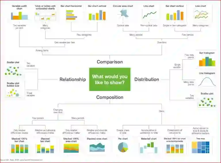
首先分享一个很棒的图表,可帮助你在工作中选择正确的可视化方法。
散点图
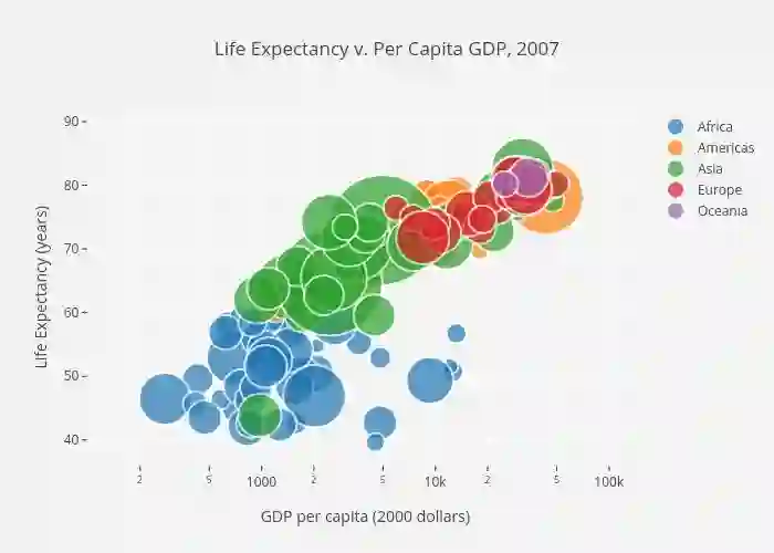
散点图非常适合展示两个变量之间的关系,你可以直接看到数据的原始分布,还可以通过对组进行简单地颜色编码来查看不同组数据的关系。
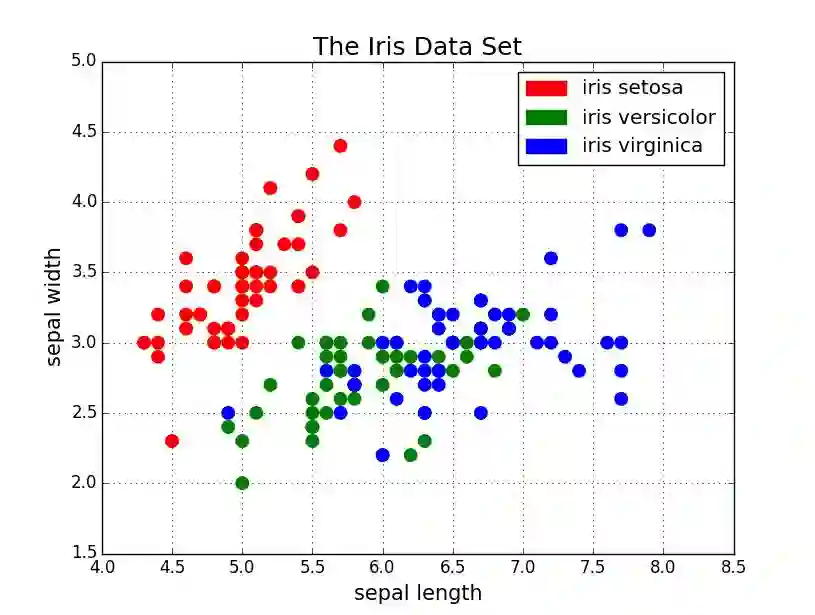
想要可视化三个变量之间的关系? 没问题! 仅需使用另一个参数(如点大小)就可以对第三个变量进行编码。
现在开始讨论代码。首先用别名 “plt” 导入 Matplotlib 的 pyplot 。要创建一个新的点阵图,我们可调用 plt.subplots() 。我们将 x 轴和 y 轴数据传递给该函数,然后将这些数据传递给 ax.scatter() 以绘制散点图。
我们还可以设置点的大小、点颜色和 alpha 透明度。你甚至可以设置 Y 轴为对数刻度。标题和坐标轴上的标签可以专门为该图设置。
import matplotlib.pyplot as pltimport numpy as npdef scatterplot(x_data, y_data, x_label="", y_label="", title="", color = "r", yscale_log=False):
   # Create the plot object
   _, ax = plt.subplots()    # Plot the data, set the size (s), color and transparency (alpha)
   # of the points
   ax.scatter(x_data, y_data, s = 10, color = color, alpha = 0.75)    if yscale_log == True:
       ax.set_yscale('log')    # Label the axes and provide a title
   ax.set_title(title)
   ax.set_xlabel(x_label)
   ax.set_ylabel(y_label)
折线图
当你可以看到一个变量随着另一个变量明显变化的时候,比如说它们有一个大的协方差,那最好使用折线图。如下图,我们可以清晰地看到对于所有的主线随着时间都有大量的变化。另外,我们也可以通过彩色编码进行分组。
这里是折线图的代码。它和上面的散点图很相似,只是在一些变量上有小的变化。
def lineplot(x_data, y_data, x_label="", y_label="", title=""):
   # Create the plot object
   _, ax = plt.subplots()    # Plot the best fit line, set the linewidth (lw), color and
   # transparency (alpha) of the line
   ax.plot(x_data, y_data, lw = 2, color = '#539caf', alpha = 1)    # Label the axes and provide a title
   ax.set_title(title)
   ax.set_xlabel(x_label)
   ax.set_ylabel(y_label)
直方图
直方图对于查看(或真正地探索)数据点的分布是很有用的。查看下面我们以频率和 IQ 做的直方图。我们可以清楚地看到朝中间聚集,并且能看到中位数是多少。
我们也可以看到它呈正态分布。使用直方图真得能清晰地呈现出各个组的频率之间的相对差别。
组的使用(离散化)真正地帮助我们看到了“更加宏观的图形”,然而当我们使用所有没有离散组的数据点时,将对可视化可能造成许多干扰,使得看清真正发生了什么变得困难。
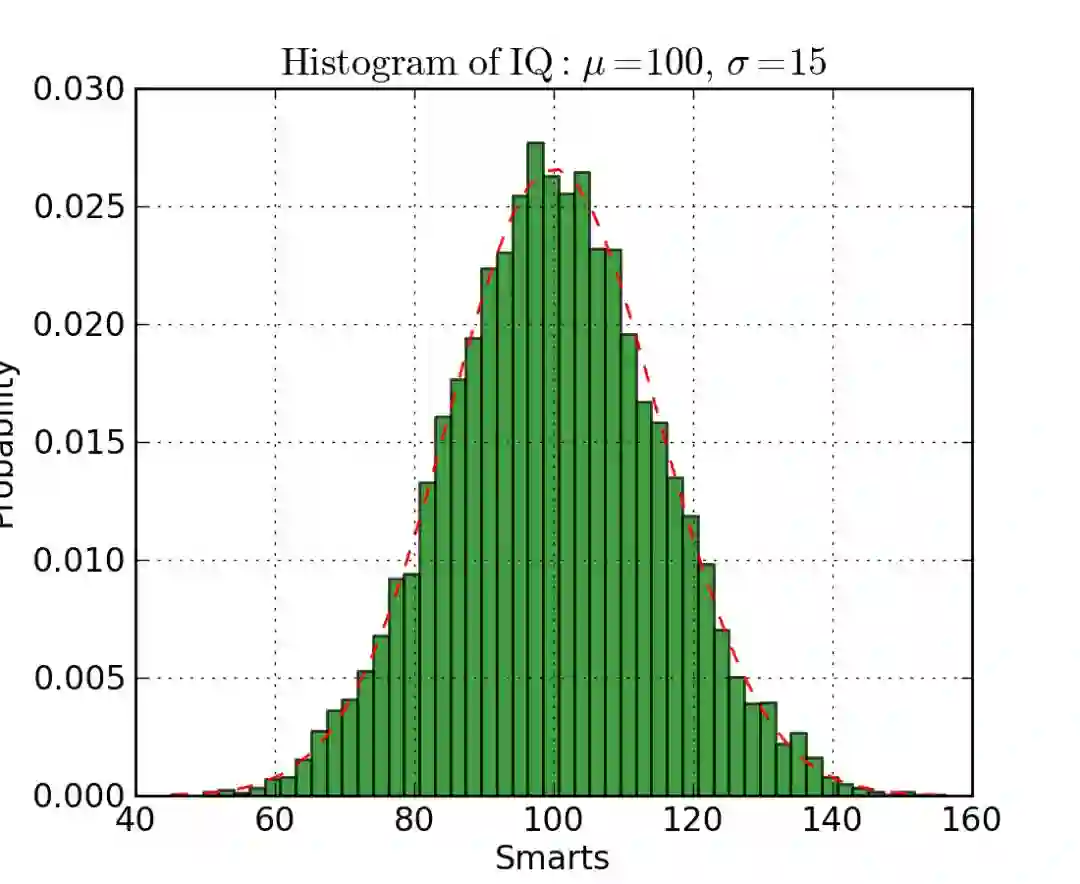
下面是在 Matplotlib 中的直方图代码。有两个参数需要注意一下:首先,参数 n_bins 控制我们想要在直方图中有多少个离散的组。更多的组将给我们提供更加完善的信息,但是也许也会引进干扰,使得我们远离全局;另一方面,较少的组给我们一种更多的是“鸟瞰图”和没有更多细节的全局图。
其次,参数 cumulative 是一个布尔值,允许我们选择直方图是否为累加的,基本上就是选择是 PDF(Probability Density Function,概率密度函数)还是 CDF(Cumulative Density Function,累积密度函数)。
def histogram(data, n_bins, cumulative=False, x_label = "", y_label = "", title = ""):
   _, ax = plt.subplots()
   ax.hist(data, n_bins = n_bins, cumulative = cumulative, color = '#539caf')
   ax.set_ylabel(y_label)
   ax.set_xlabel(x_label)
   ax.set_title(title)
想象一下我们想要比较数据中两个变量的分布。有人可能会想你必须制作两张直方图,并且把它们并排放在一起进行比较。然而,实际上有一种更好的办法:我们可以使用不同的透明度对直方图进行叠加覆盖。
看下图,均匀分布的透明度设置为 0.5 ,使得我们可以看到他背后的图形。这样我们就可以直接在同一张图表里看到两个分布。
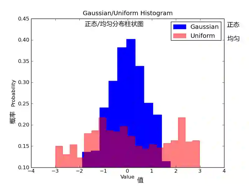
对于重叠的直方图,需要设置一些东西。首先,我们设置可同时容纳不同分布的横轴范围。根据这个范围和期望的组数,我们可以真正地计算出每个组的宽度。最后,我们在同一张图上绘制两个直方图,其中有一个稍微更透明一些。
# Overlay 2 histograms to compare themdef overlaid_histogram(data1, data2, n_bins = 0, data1_name="", data1_color="#539caf", data2_name="", data2_color="#7663b0", x_label="", y_label="", title=""):
   # Set the bounds for the bins so that the two distributions are fairly compared
   max_nbins = 10
   data_range = [min(min(data1), min(data2)), max(max(data1), max(data2))]
   binwidth = (data_range[1] - data_range[0]) / max_nbins    if n_bins == 0
   bins = np.arange(data_range[0], data_range[1] + binwidth, binwidth)    else:
   bins = n_bins    # Create the plot
   _, ax = plt.subplots()
   ax.hist(data1, bins = bins, color = data1_color, alpha = 1, label = data1_name)
   ax.hist(data2, bins = bins, color = data2_color, alpha = 0.75, label = data2_name)
   ax.set_ylabel(y_label)
   ax.set_xlabel(x_label)
   ax.set_title(title)
   ax.legend(loc = 'best')
柱状图
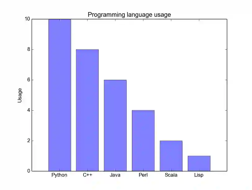
当你试图将类别很少(可能小于10)的分类数据可视化的时候,柱状图是最有效的。因为你可以很容易地看到基于柱的类别之间的区别(比如大小);分类也很容易划分和用颜色进行编码。
柱状图分为三种:常规的,分组的,堆叠的。
常规的柱状图,在 barplot() 函数中,xdata 表示 x 轴上的标记,ydata 表示 y 轴上的杆高度。误差条是一条以每条柱为中心的额外的线,可以画出标准偏差。
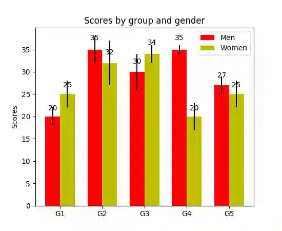
分组的柱状图让我们可以比较多个分类变量。我们比较的第一个变量是不同组的分数是如何变化的(组是G1,G2,……等等)。我们也在比较性别本身和颜色代码。
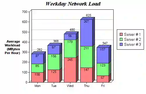
堆叠柱状图可以很好地观察不同变量的分类。下图比较了每天的服务器负载。通过颜色编码后的堆栈图,我们可以很容易地看到和理解哪些服务器每天工作最多,以及与其他服务器进行比较负载情况如何。此代码的代码与分组的条形图相同。我们循环遍历每一组,但这次我们把新柱放在旧柱上,而不是放在它们的旁边。
def barplot(x_data, y_data, error_data, x_label="", y_label="", title=""):
   _, ax = plt.subplots()
   # Draw bars, position them in the center of the tick mark on the x-axis
   ax.bar(x_data, y_data, color = '#539caf', align = 'center')
   # Draw error bars to show standard deviation, set ls to 'none'
   # to remove line between points
   ax.errorbar(x_data, y_data, yerr = error_data, color = '#297083', ls = 'none', lw = 2, capthick = 2)
   ax.set_ylabel(y_label)
   ax.set_xlabel(x_label)
   ax.set_title(title)

def stackedbarplot(x_data, y_data_list, colors, y_data_names="", x_label="", y_label="", title=""):
   _, ax = plt.subplots()
   # Draw bars, one category at a time
   for i in range(0, len(y_data_list)):
       if i == 0:
           ax.bar(x_data, y_data_list[i], color = colors[i], align = 'center', label = y_data_names[i])
       else:
           # For each category after the first, the bottom of the
           # bar will be the top of the last category
           ax.bar(x_data, y_data_list[i], color = colors[i], bottom = y_data_list[i - 1], align = 'center', label = y_data_names[i])
   ax.set_ylabel(y_label)
   ax.set_xlabel(x_label)
   ax.set_title(title)
   ax.legend(loc = 'upper right')

def groupedbarplot(x_data, y_data_list, colors, y_data_names="", x_label="", y_label="", title=""):
   _, ax = plt.subplots()
   # Total width for all bars at one x location
   total_width = 0.8
   # Width of each individual bar
   ind_width = total_width / len(y_data_list)
   # This centers each cluster of bars about the x tick mark
   alteration = np.arange(-(total_width/2), total_width/2, ind_width)

   # Draw bars, one category at a time
   for i in range(0, len(y_data_list)):
       # Move the bar to the right on the x-axis so it doesn't
       # overlap with previously drawn ones
       ax.bar(x_data + alteration[i], y_data_list[i], color = colors[i], label = y_data_names[i], width = ind_width)
   ax.set_ylabel(y_label)
   ax.set_xlabel(x_label)
   ax.set_title(title)
   ax.legend(loc = 'upper right')
箱形图
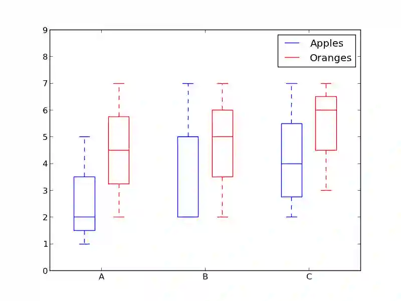
直方图很好地可视化了变量的分布。但是如果我们需要更多的信息呢?也许我们想要更清晰的看到标准偏差?也许中值与均值有很大不同,我们有很多离群值?如果有这样的偏移和许多值都集中在一边呢?
这就是箱形图所适合干的事情了。箱形图给我们提供了上面所有的信息。实线框的底部和顶部总是第一个和第三个四分位(比如 25% 和 75% 的数据),箱体中的横线总是第二个四分位(中位数)。像胡须一样的线(虚线和结尾的条线)从这个箱体伸出,显示数据的范围。
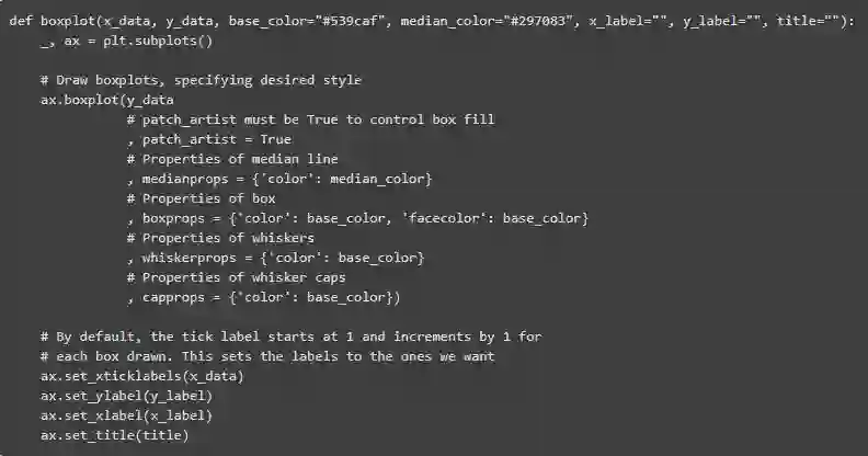
由于每个组/变量的框图都是分别绘制的,所以很容易设置。xdata 是一个组/变量的列表。Matplotlib 库的 boxplot() 函数为 ydata 中的每一列或每一个向量绘制一个箱体。因此,xdata 中的每个值对应于 ydata 中的一个列/向量。我们所要设置的就是箱体的美观。
以上就是使用 Matplotlib 来实现数据可视化方法。希望你喜欢这篇文章,并且学到了一些新的有用的技巧。
★推荐阅读★