教你如何用 Python 三行代码做动图!


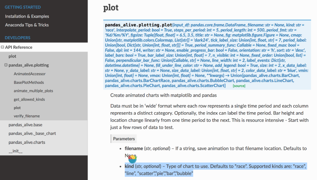
import pandas_aliveimport pandas as pdcovid_df = pd.read_csv('data/covid19.csv', index_col=0, parse_dates=[0])covid_df.plot_animated(filename='examples/example-barh-chart.gif', n_visible=15)

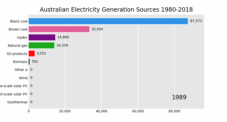
elec_df = pd.read_csv("data/Aus_Elec_Gen_1980_2018.csv", index_col=0, parse_dates=[0], thousands=',')elec_df = elec_df.iloc[:20, :]elec_df.fillna(0).plot_animated('examples/example-electricity-generated-australia.gif', period_fmt="%Y",title='Australian Electricity Generation Sources 1980-2018')

covid_df = pd.read_csv('data/covid19.csv', index_col=0, parse_dates=[0])covid_df.plot_animated(filename='examples/example-barv-chart.gif', orientation='v', n_visible=15)

covid_df = pd.read_csv('data/covid19.csv', index_col=0, parse_dates=[0])covid_df.diff().fillna(0).plot_animated(filename='examples/example-line-chart.gif', kind='line', period_label={'x': 0.25, 'y': 0.9})

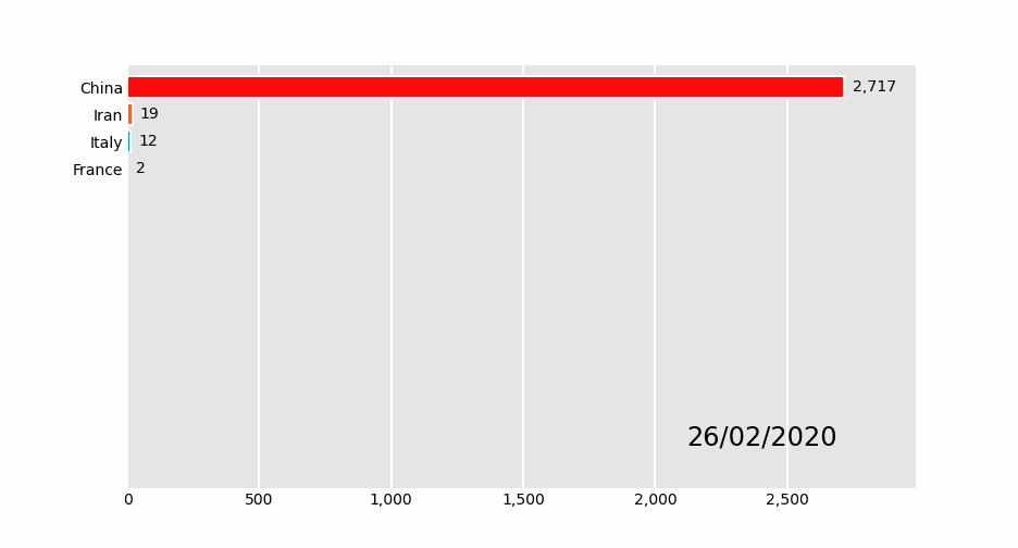
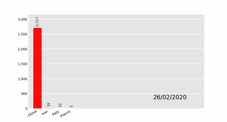
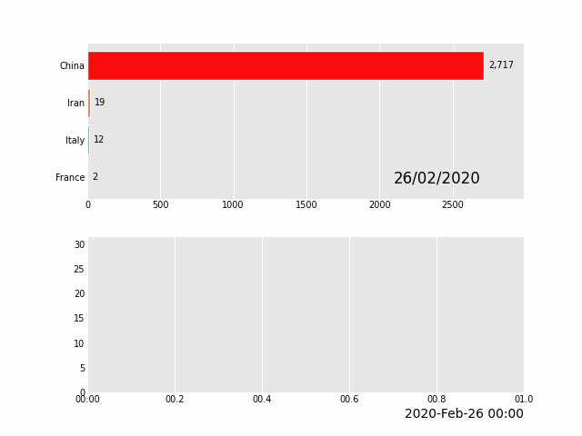
covid_df = pd.read_csv('data/covid19.csv', index_col=0, parse_dates=[0])covid_df.sum(axis=1).fillna(0).plot_animated(filename='examples/example-bar-chart.gif', kind='bar', period_label={'x': 0.1, 'y': 0.9}, enable_progress_bar=True, steps_per_period=2, interpolate_period=True, period_length=200)

max_temp_df = pd.read_csv("data/Newcastle_Australia_Max_Temps.csv",parse_dates={"Timestamp": ["Year", "Month", "Day"]},)min_temp_df = pd.read_csv("data/Newcastle_Australia_Min_Temps.csv",parse_dates={"Timestamp": ["Year", "Month", "Day"]},)max_temp_df = max_temp_df.iloc[:5000, :]min_temp_df = min_temp_df.iloc[:5000, :]merged_temp_df = pd.merge_asof(max_temp_df, min_temp_df, on="Timestamp")merged_temp_df.index = pd.to_datetime(merged_temp_df["Timestamp"].dt.strftime('%Y/%m/%d'))keep_columns = ["Minimum temperature (Degree C)", "Maximum temperature (Degree C)"]merged_temp_df[keep_columns].resample("Y").mean().plot_animated(filename='examples/example-scatter-chart.gif', kind="scatter",title='Max & Min Temperature Newcastle, Australia')

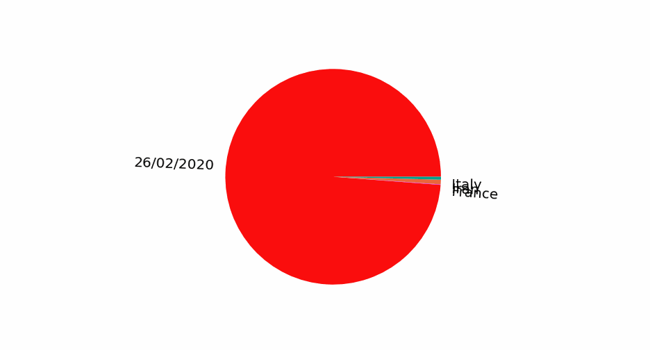
covid_df = pd.read_csv('data/covid19.csv', index_col=0, parse_dates=[0])covid_df.plot_animated(filename='examples/example-pie-chart.gif', kind="pie",rotatelabels=True, period_label={'x': 0, 'y': 0})

      multi_index_df = pd.read_csv("data/multi.csv", header=[0, 1], index_col=0)multi_index_df.index = pd.to_datetime(multi_index_df.index, dayfirst=True)
map_chart = multi_index_df.plot_animated(    kind="bubble",    filename="examples/example-bubble-chart.gif",    x_data_label="Longitude",    y_data_label="Latitude",    size_data_label="Cases",    color_data_label="Cases",    vmax=5, steps_per_period=3, interpolate_period=True, period_length=500,    dpi=100)

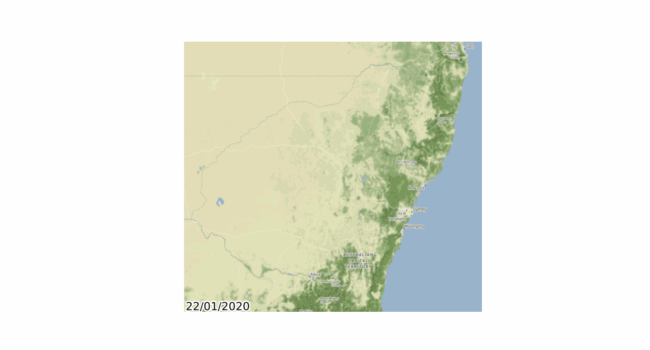
import geopandasimport pandas_aliveimport contextilygdf = geopandas.read_file('data/nsw-covid19-cases-by-postcode.gpkg')gdf.index = gdf.postcodegdf = gdf.drop('postcode',axis=1)result = gdf.iloc[:, :20]result['geometry'] = gdf.iloc[:, -1:]['geometry']map_chart = result.plot_animated(filename='examples/example-geo-point-chart.gif',basemap_format={'source':contextily.providers.Stamen.Terrain})

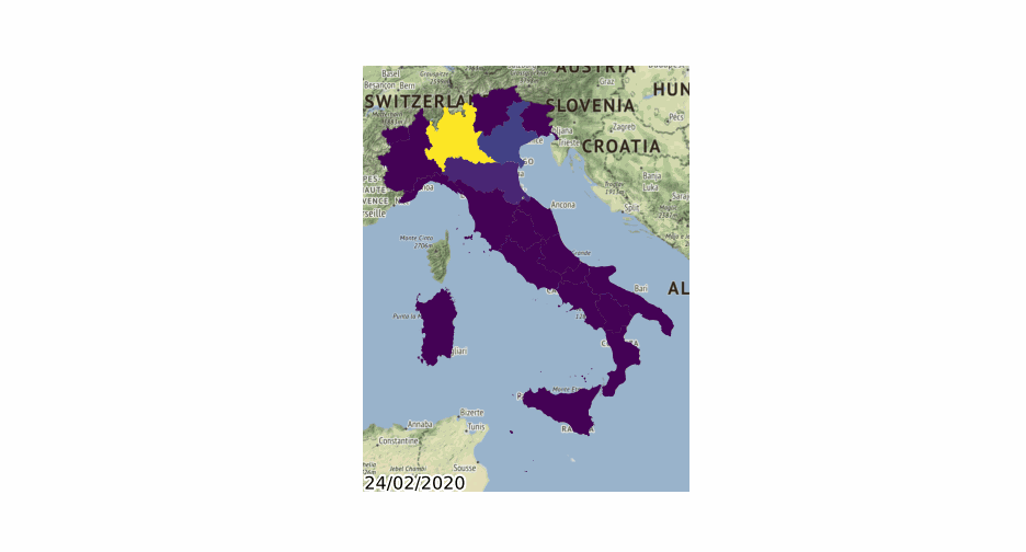
import geopandasimport pandas_aliveimport contextilygdf = geopandas.read_file('data/italy-covid-region.gpkg')gdf.index = gdf.regiongdf = gdf.drop('region',axis=1)result = gdf.iloc[:, :20]result['geometry'] = gdf.iloc[:, -1:]['geometry']map_chart = result.plot_animated(filename='examples/example-geo-polygon-chart.gif',basemap_format={'source': contextily.providers.Stamen.Terrain})

covid_df = pd.read_csv('data/covid19.csv', index_col=0, parse_dates=[0])animated_line_chart = covid_df.diff().fillna(0).plot_animated(kind='line', period_label=False,add_legend=False)animated_bar_chart = covid_df.plot_animated(n_visible=10)pandas_alive.animate_multiple_plots('examples/example-bar-and-line-chart.gif',[animated_bar_chart, animated_line_chart], enable_progress_bar=True)
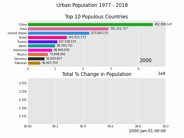
def population():urban_df = pd.read_csv("data/urban_pop.csv", index_col=0, parse_dates=[0])animated_line_chart = (urban_df.sum(axis=1).pct_change().fillna(method='bfill').mul(100).plot_animated(kind="line", title="Total % Change in Population", period_label=False, add_legend=False))animated_bar_chart = urban_df.plot_animated(n_visible=10, title='Top 10 Populous Countries', period_fmt="%Y")pandas_alive.animate_multiple_plots('examples/example-bar-and-line-urban-chart.gif',[animated_bar_chart, animated_line_chart],title='Urban Population 1977 - 2018', adjust_subplot_top=0.85,enable_progress_bar=True)
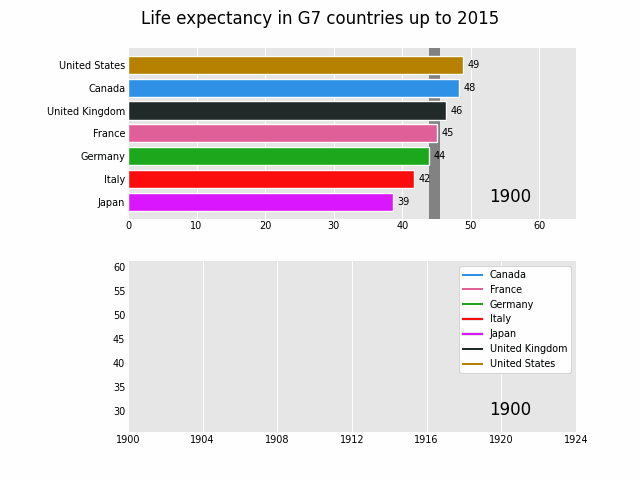
      def life():    data_raw = pd.read_csv("data/long.csv")
    list_G7 = [        "Canada",        "France",        "Germany",        "Italy",        "Japan",        "United Kingdom",        "United States",    ]
    data_raw = data_raw.pivot(        index="Year", columns="Entity", values="Life expectancy (Gapminder, UN)"    )
    data = pd.DataFrame()    data["Year"] = data_raw.reset_index()["Year"]    for country in list_G7:        data[country] = data_raw[country].values
    data = data.fillna(method="pad")    data = data.fillna(0)    data = data.set_index("Year").loc[1900:].reset_index()
    data["Year"] = pd.to_datetime(data.reset_index()["Year"].astype(str))
    data = data.set_index("Year")    data = data.iloc[:25, :]
    animated_bar_chart = data.plot_animated(        period_fmt="%Y", perpendicular_bar_func="mean", period_length=200, fixed_max=True    )
    animated_line_chart = data.plot_animated(        kind="line", period_fmt="%Y", period_length=200, fixed_max=True    )
    pandas_alive.animate_multiple_plots(        "examples/life-expectancy.gif",        plots=[animated_bar_chart, animated_line_chart],        title="Life expectancy in G7 countries up to 2015",        adjust_subplot_left=0.2, adjust_subplot_top=0.9, enable_progress_bar=True    )
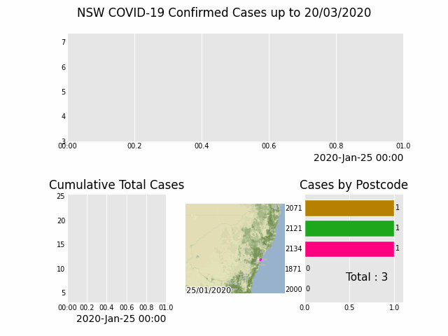
def nsw():import geopandasimport pandas as pdimport pandas_aliveimport contextilyimport matplotlib.pyplot as pltimport jsonwith open('data/package_show.json', 'r', encoding='utf8')as fp:data = json.load(fp)# Extract url to csv componentcovid_nsw_data_url = data["result"]["resources"][0]["url"]print(covid_nsw_data_url)# Read csv from data API urlnsw_covid = pd.read_csv('data/confirmed_cases_table1_location.csv')postcode_dataset = pd.read_csv("data/postcode-data.csv")# Prepare data from NSW health datasetnsw_covid = nsw_covid.fillna(9999)nsw_covid["postcode"] = nsw_covid["postcode"].astype(int)grouped_df = nsw_covid.groupby(["notification_date", "postcode"]).size()grouped_df = pd.DataFrame(grouped_df).unstack()grouped_df.columns = grouped_df.columns.droplevel().astype(str)grouped_df = grouped_df.fillna(0)grouped_df.index = pd.to_datetime(grouped_df.index)cases_df = grouped_df# Clean data in postcode dataset prior to matchinggrouped_df = grouped_df.Tpostcode_dataset = postcode_dataset[postcode_dataset['Longitude'].notna()]postcode_dataset = postcode_dataset[postcode_dataset['Longitude'] != 0]postcode_dataset = postcode_dataset[postcode_dataset['Latitude'].notna()]postcode_dataset = postcode_dataset[postcode_dataset['Latitude'] != 0]postcode_dataset['Postcode'] = postcode_dataset['Postcode'].astype(str)# Build GeoDataFrame from Lat Long dataset and make map chartgrouped_df['Longitude'] = grouped_df.index.map(postcode_dataset.set_index('Postcode')['Longitude'].to_dict())grouped_df['Latitude'] = grouped_df.index.map(postcode_dataset.set_index('Postcode')['Latitude'].to_dict())gdf = geopandas.GeoDataFrame(grouped_df, geometry=geopandas.points_from_xy(grouped_df.Longitude, grouped_df.Latitude), crs="EPSG:4326")gdf = gdf.dropna()# Prepare GeoDataFrame for writing to geopackagegdf = gdf.drop(['Longitude', 'Latitude'], axis=1)gdf.columns = gdf.columns.astype(str)gdf['postcode'] = gdf.index# gdf.to_file("data/nsw-covid19-cases-by-postcode.gpkg", layer='nsw-postcode-covid', driver="GPKG")# Prepare GeoDataFrame for plottinggdf.index = gdf.postcodegdf = gdf.drop('postcode', axis=1)gdf = gdf.to_crs("EPSG:3857") # Web Mercatorresult = gdf.iloc[:, :22]result['geometry'] = gdf.iloc[:, -1:]['geometry']gdf = resultmap_chart = gdf.plot_animated(basemap_format={'source': contextily.providers.Stamen.Terrain}, cmap='cool')# cases_df.to_csv('data/nsw-covid-cases-by-postcode.csv')cases_df = cases_df.iloc[:22, :]from datetime import datetimebar_chart = cases_df.sum(axis=1).plot_animated(kind='line',label_events={'Ruby Princess Disembark': datetime.strptime("19/03/2020", "%d/%m/%Y"),# 'Lockdown': datetime.strptime("31/03/2020", "%d/%m/%Y")},fill_under_line_color="blue",add_legend=False)map_chart.ax.set_title('Cases by Location')grouped_df = pd.read_csv('data/nsw-covid-cases-by-postcode.csv', index_col=0, parse_dates=[0])grouped_df = grouped_df.iloc[:22, :]line_chart = (grouped_df.sum(axis=1).cumsum().fillna(0).plot_animated(kind="line", period_label=False, title="Cumulative Total Cases", add_legend=False))def current_total(values):total = values.sum()s = f'Total : {int(total)}'return {'x': .85, 'y': .2, 's': s, 'ha': 'right', 'size': 11}race_chart = grouped_df.cumsum().plot_animated(n_visible=5, title="Cases by Postcode", period_label=False, period_summary_func=current_total)import timetimestr = time.strftime("%d/%m/%Y")plots = [bar_chart, line_chart, map_chart, race_chart]from matplotlib import rcParamsrcParams.update({"figure.autolayout": False})# make sure figures are `Figure()` instancesfigs = plt.Figure()gs = figs.add_gridspec(2, 3, hspace=0.5)f3_ax1 = figs.add_subplot(gs[0, :])f3_ax1.set_title(bar_chart.title)bar_chart.ax = f3_ax1f3_ax2 = figs.add_subplot(gs[1, 0])f3_ax2.set_title(line_chart.title)line_chart.ax = f3_ax2f3_ax3 = figs.add_subplot(gs[1, 1])f3_ax3.set_title(map_chart.title)map_chart.ax = f3_ax3f3_ax4 = figs.add_subplot(gs[1, 2])f3_ax4.set_title(race_chart.title)race_chart.ax = f3_ax4timestr = cases_df.index.max().strftime("%d/%m/%Y")figs.suptitle(f"NSW COVID-19 Confirmed Cases up to {timestr}")pandas_alive.animate_multiple_plots('examples/nsw-covid.gif',plots,figs,enable_progress_bar=True)
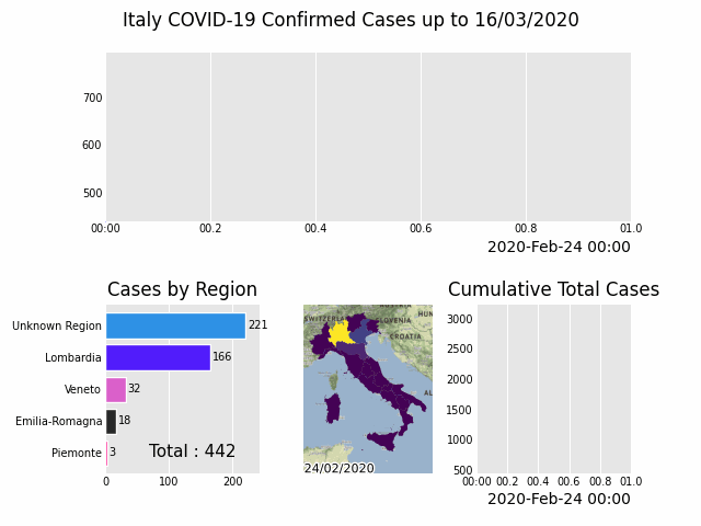
      def italy():    import geopandas    import pandas as pd    import pandas_alive    import contextily    import matplotlib.pyplot as plt
    region_gdf = geopandas.read_file('data/geo-data/italy-with-regions')    region_gdf.NOME_REG = region_gdf.NOME_REG.str.lower().str.title()    region_gdf = region_gdf.replace('Trentino-Alto Adige/Sudtirol', 'Trentino-Alto Adige')    region_gdf = region_gdf.replace("Valle D'Aosta/Vallée D'Aoste\r\nValle D'Aosta/Vallée D'Aoste", "Valle d'Aosta")
    italy_df = pd.read_csv('data/Regional Data - Sheet1.csv', index_col=0, header=1, parse_dates=[0])
    italy_df = italy_df[italy_df['Region'] != 'NA']
    cases_df = italy_df.iloc[:, :3]    cases_df['Date'] = cases_df.index    pivoted = cases_df.pivot(values='New positives', index='Date', columns='Region')    pivoted.columns = pivoted.columns.astype(str)    pivoted = pivoted.rename(columns={'nan': 'Unknown Region'})
    cases_gdf = pivoted.T    cases_gdf['geometry'] = cases_gdf.index.map(region_gdf.set_index('NOME_REG')['geometry'].to_dict())
    cases_gdf = cases_gdf[cases_gdf['geometry'].notna()]
    cases_gdf = geopandas.GeoDataFrame(cases_gdf, crs=region_gdf.crs, geometry=cases_gdf.geometry)
    gdf = cases_gdf
    result = gdf.iloc[:, :22]    result['geometry'] = gdf.iloc[:, -1:]['geometry']    gdf = result
    map_chart = gdf.plot_animated(basemap_format={'source': contextily.providers.Stamen.Terrain}, cmap='viridis')
    cases_df = pivoted    cases_df = cases_df.iloc[:22, :]
    from datetime import datetime
    bar_chart = cases_df.sum(axis=1).plot_animated(        kind='line',        label_events={            'Schools Close': datetime.strptime("4/03/2020", "%d/%m/%Y"),            'Phase I Lockdown': datetime.strptime("11/03/2020", "%d/%m/%Y"),            # '1M Global Cases': datetime.strptime("02/04/2020", "%d/%m/%Y"),            # '100k Global Deaths': datetime.strptime("10/04/2020", "%d/%m/%Y"),            # 'Manufacturing Reopens': datetime.strptime("26/04/2020", "%d/%m/%Y"),            # 'Phase II Lockdown': datetime.strptime("4/05/2020", "%d/%m/%Y"),        },        fill_under_line_color="blue",        add_legend=False    )
    map_chart.ax.set_title('Cases by Location')
    line_chart = (        cases_df.sum(axis=1)            .cumsum()            .fillna(0)            .plot_animated(kind="line", period_label=False, title="Cumulative Total Cases", add_legend=False)    )
    def current_total(values):        total = values.sum()        s = f'Total : {int(total)}'        return {'x': .85, 'y': .1, 's': s, 'ha': 'right', 'size': 11}
    race_chart = cases_df.cumsum().plot_animated(        n_visible=5, title="Cases by Region", period_label=False, period_summary_func=current_total    )
    import time
    timestr = time.strftime("%d/%m/%Y")
    plots = [bar_chart, race_chart, map_chart, line_chart]
    # Otherwise titles overlap and adjust_subplot does nothing    from matplotlib import rcParams    from matplotlib.animation import FuncAnimation
    rcParams.update({"figure.autolayout": False})    # make sure figures are `Figure()` instances    figs = plt.Figure()    gs = figs.add_gridspec(2, 3, hspace=0.5)    f3_ax1 = figs.add_subplot(gs[0, :])    f3_ax1.set_title(bar_chart.title)    bar_chart.ax = f3_ax1
    f3_ax2 = figs.add_subplot(gs[1, 0])    f3_ax2.set_title(race_chart.title)    race_chart.ax = f3_ax2
    f3_ax3 = figs.add_subplot(gs[1, 1])    f3_ax3.set_title(map_chart.title)    map_chart.ax = f3_ax3
    f3_ax4 = figs.add_subplot(gs[1, 2])    f3_ax4.set_title(line_chart.title)    line_chart.ax = f3_ax4
    axes = [f3_ax1, f3_ax2, f3_ax3, f3_ax4]    timestr = cases_df.index.max().strftime("%d/%m/%Y")    figs.suptitle(f"Italy COVID-19 Confirmed Cases up to {timestr}")
    pandas_alive.animate_multiple_plots(        'examples/italy-covid.gif',        plots,        figs,        enable_progress_bar=True    )
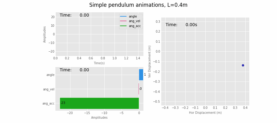
def simple():import pandas as pdimport matplotlib.pyplot as pltimport pandas_aliveimport numpy as np# Physical constantsg = 9.81L = .4mu = 0.2THETA_0 = np.pi * 70 / 180 # init angle = 70degsTHETA_DOT_0 = 0 # no init angVelDELTA_T = 0.01 # time steppingT = 1.5 # time period# Definition of ODE (ordinary differential equation)def get_theta_double_dot(theta, theta_dot):return -mu * theta_dot - (g / L) * np.sin(theta)# Solution to the differential equationdef pendulum(t):# initialise changing valuestheta = THETA_0theta_dot = THETA_DOT_0delta_t = DELTA_Tang = []ang_vel = []ang_acc = []times = []for time in np.arange(0, t, delta_t):theta_double_dot = get_theta_double_dot(theta, theta_dot)theta += theta_dot * delta_ttheta_dot += theta_double_dot * delta_ttimes.append(time)ang.append(theta)ang_vel.append(theta_dot)ang_acc.append(theta_double_dot)data = np.array([ang, ang_vel, ang_acc])return pd.DataFrame(data=data.T, index=np.array(times), columns=["angle", "ang_vel", "ang_acc"])# units used for ref: ["angle [rad]", "ang_vel [rad/s]", "ang_acc [rad/s^2]"]df = pendulum(T)df.index.names = ["Time (s)"]print(df)# generate dataFrame for animated bubble plotdf2 = pd.DataFrame(index=df.index)df2["dx (m)"] = L * np.sin(df["angle"])df2["dy (m)"] = -L * np.cos(df["angle"])df2["ang_vel"] = abs(df["ang_vel"])df2["size"] = df2["ang_vel"] * 100 # scale angular vels to get nice size on bubble plotprint(df2)# static pandas plots## print(plt.style.available)# NOTE: 2 lines below required in Jupyter to switch styles correctlyplt.rcParams.update(plt.rcParamsDefault)plt.style.use("ggplot") # set plot stylefig, (ax1a, ax2b) = plt.subplots(1, 2, figsize=(8, 4), dpi=100) # 1 row, 2 subplots# fig.subplots_adjust(wspace=0.1) # space subplots in rowfig.set_tight_layout(True)fontsize = "small"df.plot(ax=ax1a).legend(fontsize=fontsize)ax1a.set_title("Outputs vs Time", fontsize="medium")ax1a.set_xlabel('Time [s]', fontsize=fontsize)ax1a.set_ylabel('Amplitudes', fontsize=fontsize);df.plot(ax=ax2b, x="angle", y=["ang_vel", "ang_acc"]).legend(fontsize=fontsize)ax2b.set_title("Outputs vs Angle | Phase-Space", fontsize="medium")ax2b.set_xlabel('Angle [rad]', fontsize=fontsize)ax2b.set_ylabel('Angular Velocity / Acc', fontsize=fontsize)# sample scatter plot with colorbarfig, ax = plt.subplots()sc = ax.scatter(df2["dx (m)"], df2["dy (m)"], s=df2["size"] * .1, c=df2["ang_vel"], cmap="jet")cbar = fig.colorbar(sc)cbar.set_label(label="ang_vel [rad/s]", fontsize="small")# sc.set_clim(350, 400)ax.tick_params(labelrotation=0, labelsize="medium")ax_scale = 1.ax.set_xlim(-L * ax_scale, L * ax_scale)ax.set_ylim(-L * ax_scale - 0.1, L * ax_scale - 0.1)# make axes square: a circle shows as a circleax.set_aspect(1 / ax.get_data_ratio())ax.arrow(0, 0, df2["dx (m)"].iloc[-1], df2["dy (m)"].iloc[-1],color="dimgray", ls=":", lw=2.5, width=.0, head_width=0, zorder=-1)ax.text(0, 0.15, s="size and colour of pendulum bob\nbased on pd column\nfor angular velocity",ha='center', va='center')# plt.show()dpi = 100ax_scale = 1.1figsize = (3, 3)fontsize = "small"# set up figure to pass onto `pandas_alive`# NOTE: by using Figure (capital F) instead of figure() `FuncAnimation` seems to run twice as fast!# fig1, ax1 = plt.subplots()fig1 = plt.Figure()ax1 = fig1.add_subplot()fig1.set_size_inches(figsize)ax1.set_title("Simple pendulum animation, L=" + str(L) + "m", fontsize="medium")ax1.set_xlabel("Time (s)", color='dimgray', fontsize=fontsize)ax1.set_ylabel("Amplitudes", color='dimgray', fontsize=fontsize)ax1.tick_params(labelsize=fontsize)# pandas_aliveline_chart = df.plot_animated(filename="pend-line.gif", kind='line', period_label={'x': 0.05, 'y': 0.9},steps_per_period=1, interpolate_period=False, period_length=50,period_fmt='Time:{x:10.2f}',enable_progress_bar=True, fixed_max=True, dpi=100, fig=fig1)plt.close()# Video('examples/pend-line.mp4', html_attributes="controls muted autoplay")# set up and generate animated scatter plot## set up figure to pass onto `pandas_alive`# NOTE: by using Figure (capital F) instead of figure() `FuncAnimation` seems to run twice as fast!fig1sc = plt.Figure()ax1sc = fig1sc.add_subplot()fig1sc.set_size_inches(figsize)ax1sc.set_title("Simple pendulum animation, L=" + str(L) + "m", fontsize="medium")ax1sc.set_xlabel("Time (s)", color='dimgray', fontsize=fontsize)ax1sc.set_ylabel("Amplitudes", color='dimgray', fontsize=fontsize)ax1sc.tick_params(labelsize=fontsize)# pandas_alivescatter_chart = df.plot_animated(filename="pend-scatter.gif", kind='scatter', period_label={'x': 0.05, 'y': 0.9},steps_per_period=1, interpolate_period=False, period_length=50,period_fmt='Time:{x:10.2f}',enable_progress_bar=True, fixed_max=True, dpi=100, fig=fig1sc, size="ang_vel")plt.close()print("Points size follows one of the pd columns: ang_vel")# Video('./pend-scatter.gif', html_attributes="controls muted autoplay")# set up and generate animated bar race chart## set up figure to pass onto `pandas_alive`# NOTE: by using Figure (capital F) instead of figure() `FuncAnimation` seems to run twice as fast!fig2 = plt.Figure()ax2 = fig2.add_subplot()fig2.set_size_inches(figsize)ax2.set_title("Simple pendulum animation, L=" + str(L) + "m", fontsize="medium")ax2.set_xlabel("Amplitudes", color='dimgray', fontsize=fontsize)ax2.set_ylabel("", color='dimgray', fontsize="x-small")ax2.tick_params(labelsize=fontsize)# pandas_aliverace_chart = df.plot_animated(filename="pend-race.gif", kind='race', period_label={'x': 0.05, 'y': 0.9},steps_per_period=1, interpolate_period=False, period_length=50,period_fmt='Time:{x:10.2f}',enable_progress_bar=True, fixed_max=False, dpi=100, fig=fig2)plt.close()# set up and generate bubble animated plot## set up figure to pass onto `pandas_alive`# NOTE: by using Figure (capital F) instead of figure() `FuncAnimation` seems to run twice as fast!fig3 = plt.Figure()ax3 = fig3.add_subplot()fig3.set_size_inches(figsize)ax3.set_title("Simple pendulum animation, L=" + str(L) + "m", fontsize="medium")ax3.set_xlabel("Hor Displacement (m)", color='dimgray', fontsize=fontsize)ax3.set_ylabel("Ver Displacement (m)", color='dimgray', fontsize=fontsize)# limits & ratio below get the graph squareax3.set_xlim(-L * ax_scale, L * ax_scale)ax3.set_ylim(-L * ax_scale - 0.1, L * ax_scale - 0.1)ratio = 1. # this is visual ratio of axesax3.set_aspect(ratio / ax3.get_data_ratio())ax3.arrow(0, 0, df2["dx (m)"].iloc[-1], df2["dy (m)"].iloc[-1],color="dimgray", ls=":", lw=1, width=.0, head_width=0, zorder=-1)# pandas_alivebubble_chart = df2.plot_animated(kind="bubble", filename="pend-bubble.gif",x_data_label="dx (m)", y_data_label="dy (m)",size_data_label="size", color_data_label="ang_vel", cmap="jet",period_label={'x': 0.05, 'y': 0.9}, vmin=None, vmax=None,steps_per_period=1, interpolate_period=False, period_length=50, period_fmt='Time:{x:10.2f}s',enable_progress_bar=True, fixed_max=False, dpi=dpi, fig=fig3)plt.close()print("Bubble size & colour animates with pd data column for ang_vel.")# Combined plots#fontsize = "x-small"# Otherwise titles overlap and subplots_adjust does nothingfrom matplotlib import rcParamsrcParams.update({"figure.autolayout": False})figs = plt.Figure(figsize=(9, 4), dpi=100)figs.subplots_adjust(wspace=0.1)gs = figs.add_gridspec(2, 2)ax1 = figs.add_subplot(gs[0, 0])ax1.set_xlabel("Time(s)", color='dimgray', fontsize=fontsize)ax1.set_ylabel("Amplitudes", color='dimgray', fontsize=fontsize)ax1.tick_params(labelsize=fontsize)ax2 = figs.add_subplot(gs[1, 0])ax2.set_xlabel("Amplitudes", color='dimgray', fontsize=fontsize)ax2.set_ylabel("", color='dimgray', fontsize=fontsize)ax2.tick_params(labelsize=fontsize)ax3 = figs.add_subplot(gs[:, 1])ax3.set_xlabel("Hor Displacement (m)", color='dimgray', fontsize=fontsize)ax3.set_ylabel("Ver Displacement (m)", color='dimgray', fontsize=fontsize)ax3.tick_params(labelsize=fontsize)# limits & ratio below get the graph squareax3.set_xlim(-L * ax_scale, L * ax_scale)ax3.set_ylim(-L * ax_scale - 0.1, L * ax_scale - 0.1)ratio = 1. # this is visual ratio of axesax3.set_aspect(ratio / ax3.get_data_ratio())line_chart.ax = ax1race_chart.ax = ax2bubble_chart.ax = ax3plots = [line_chart, race_chart, bubble_chart]# pandas_alive combined using custom figurepandas_alive.animate_multiple_plots(filename='pend-combined.gif', plots=plots, custom_fig=figs, dpi=100, enable_progress_bar=True,adjust_subplot_left=0.2, adjust_subplot_right=None,title="Simple pendulum animations, L=" + str(L) + "m", title_fontsize="medium")plt.close()
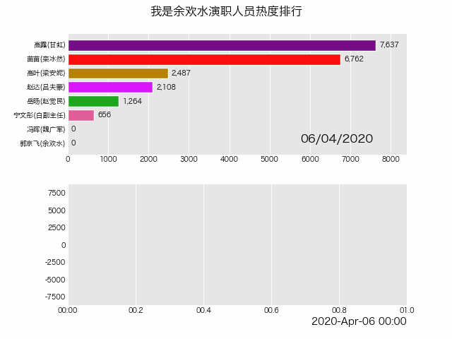
# 中文显示plt.rcParams['font.sans-serif'] = ['SimHei'] # Windowsplt.rcParams['font.sans-serif'] = ['Hiragino Sans GB'] # Macplt.rcParams['axes.unicode_minus'] = False# 读取数据df_result = pd.read_csv('data/yuhuanshui.csv', index_col=0, parse_dates=[0])# 生成图表animated_line_chart = df_result.diff().fillna(0).plot_animated(kind='line', period_label=False, add_legend=False)animated_bar_chart = df_result.plot_animated(n_visible=10)pandas_alive.animate_multiple_plots('examples/yuhuanshui.gif',[animated_bar_chart, animated_line_chart], enable_progress_bar=True,title='我是余欢水演职人员热度排行')


更多精彩推荐
☞GitHub 年度报告正式发布,JavaScript 霸榜、TypeScript 爆发!
☞中国实现量子计算第一个里程碑:原型机 “九章”比最快的超级计算机快一百万亿倍
☞酷派奖励程序员10 万股期权!因代码贡献受 Linux 之父亲自点名赞赏
☞常年“盘踞”数据库前五的 MongoDB,在中国有哪些新动向?
☞开发者实测 M1 芯片报告:除了大型应用程序启动慢点,整体性能优秀
![]()
点分享 ![]()
点点赞 ![]()
点在看


登录查看更多
相关内容

CASES:International Conference on Compilers, Architectures, and Synthesis for Embedded Systems。
Explanation:嵌入式系统编译器、体系结构和综合国际会议。
Publisher:ACM。
SIT: http://dblp.uni-trier.de/db/conf/cases/index.html
Arxiv
0+阅读 · 2021年2月11日
Arxiv
4+阅读 · 2017年12月19日


相关VIP内容
相关资讯
相关论文
Arxiv
0+阅读 · 2021年2月11日
Arxiv
4+阅读 · 2017年12月19日