医学影像深度学习系列(一)X-ray数据及数据处理

序
根据自己研究内容和方向,我将会花一些时间整理一些深度学习应用于医疗影像数据的相关知识点,跟大家分享一些关于这一个细分领域重要的理论和概念,同时,也包括一些经验总结和必要的代码编写。希望能帮助到对这个领域感兴趣的初学者,同时,也希望大家提出宝贵意见,以及分享自己的研究心得。如果有任何错误的地方,希望不吝赐教和指正。
我们用到的数据库是著名的ChestX-ray8 dataset,包含数万张X-ray图像。数据下载的链接为:
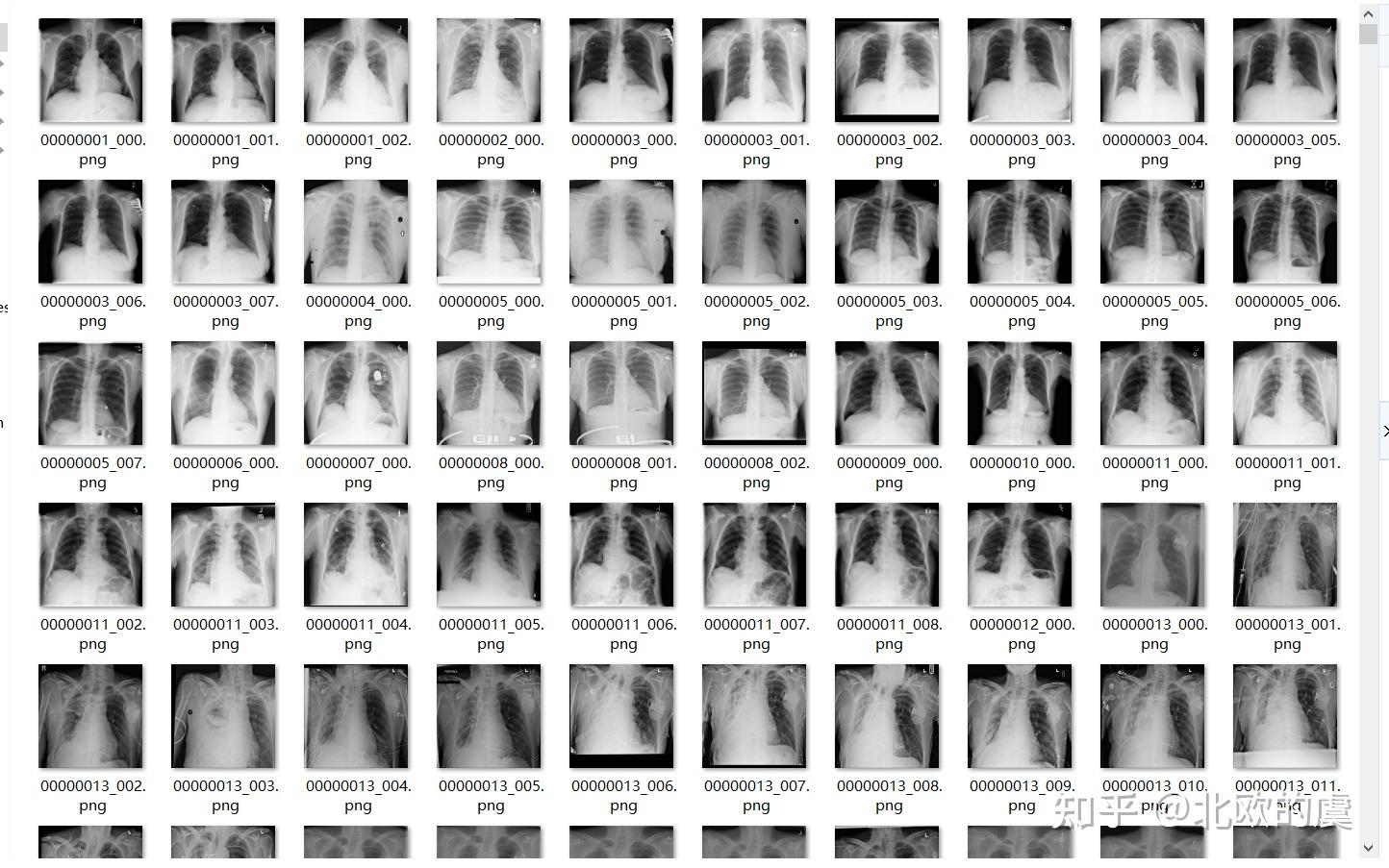
让我们打开下载好的文件看一下这些数据的样子,如下图:

我们来看一下这些数据的大概情况,首先加载必要的包:
import pandas as pd
import numpy as np
import matplotlib.pyplot as plt
from keras.preprocessing.image import ImageDataGenerator
%matplotlib inline
import os
import seaborn as sns
sns.set()
我们取其中1000个数据的label来看一下来看一下:
train_df = pd.read_csv("d:/zhihu/train.csv")
print(f'There are {train_df.shape[0]} rows and {train_df.shape[1]} columns in this data frame')
train_df.head()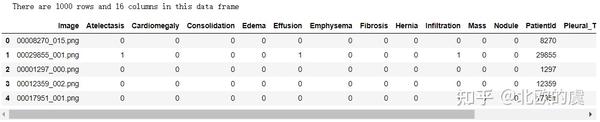
打印出前5行,大家可以看到图片格式为png,然后列名为各种疾病的名称,然后还有一列很重要的就是patient ID,然后其中相应的疾病为阴性,标签为0,阳性为1.
这里需要特别注明一下,医学影像是涉及多标签多任务模式的(muti-task),因为医生能从一张图像上观察到多种疾病是否为阳性,这样我们就可以用一个模型来分类多种疾病,而不需要建立多个模型,这点很重要。后面的文章我会再次详述。
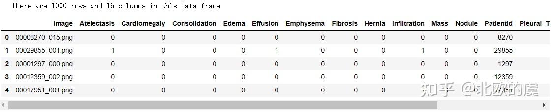
我们再来看一下这个表的综述:
train_df.info()

大家可以清楚看到其中包括14中疾病
接下来,我们需要检查一下patient ID是否重复,为什么要做这个工作呢,原因是,如果在数据集中有重复的病人ID,当我们在设置train set和test set的时候会用相同的病人出现在两个数据集了,那么造成的后果就是测试数据的精度被提高了,试想一下,极端情况下,如果两个数据集相同,那测试的结果会达到和训练时一样的精度。因此我们需要剔除相同的病人ID,以保证训练数据和测试数据没有相同的病人ID。
让我们来看一下我们的数据:
print(f"The total patient ids are {train_df['PatientId'].count()}, from those the unique ids are {train_df['PatientId'].value_counts().shape[0]} ")

总数据为1000个,而唯一的数据为928个,那就因为这有72个重复的病人ID,因此我们要剔除他们。如何剔除他们,我会在以后的文章中讨论。
我们再对这个label表做一下处理,一处不必要的列:
columns = train_df.keys()
columns = list(columns)
print(columns)

columns.remove('Image')
columns.remove('PatientId')

for column in columns:
    print(f"The class {column} has {train_df[column].sum()} samples")
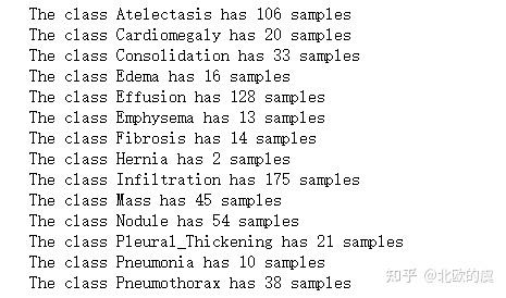
大家可以看到14种疾病每种程阳性的病例数,例如第4个edema水肿,只有16个病例。
因此整个数据集中阳性阴性的比例是非常不平衡的,这就会为我们训练模型和损失函数带来困难。那为什么数据集会如此的不平衡呢,因为,在现实中,得病的人数总是远远小于没有得病的人数,因此大多是疾病,在我们们获取样本的时候,都是阳性数远小于阴性的。那这就带来了另外一个问题,就是医疗数据集,往往是不平衡的,那这个问题我们以后的文章再讨论如何处理这样的情况以达到平衡。
然后接下来一个重要的工作,就是我们需要标准化一下这个X-ray图像,我们先来看看这些图像上的像素分布情况,我们任取其中的一个图像,并可视化一下像素分布:
sample_img = train_df.Image[0]
raw_image = plt.imread(os.path.join(img_dir, sample_img))
plt.imshow(raw_image, cmap='gray')
plt.colorbar()
plt.title('Raw Chest X Ray Image')
print(f"The dimensions of the image are {raw_image.shape[0]} pixels width and {raw_image.shape[1]} pixels height, one single color channel")
print(f"The maximum pixel value is {raw_image.max():.4f} and the minimum is {raw_image.min():.4f}")
print(f"The mean value of the pixels is {raw_image.mean():.4f} and the standard deviation is {raw_image.std():.4f}")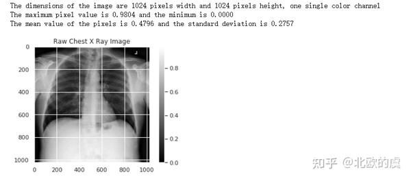
sns.distplot(raw_image.ravel(),
             label=f'Pixel Mean {np.mean(raw_image):.4f} & Standard Deviation {np.std(raw_image):.4f}', kde=False)
plt.legend(loc='upper center')
plt.title('Distribution of Pixel Intensities in the Image')
plt.xlabel('Pixel Intensity')
plt.ylabel('# Pixels in Image')
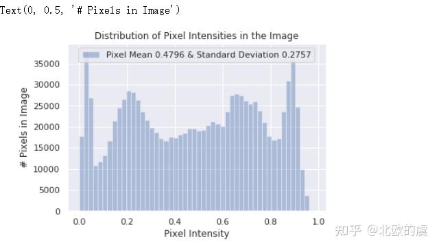
我们可以看到像素的分布不是非常平整,因此我们需要标准化像素,利用一下keras.preprocessing.image中的ImageDataGenerator:
image_generator = ImageDataGenerator(
    samplewise_center=True,
    samplewise_std_normalization= True
)
然后根据将正态分布转换为标准正态分布的公式:

我们将图像进行标准化,即将图像像素转化为均值为0,标准差为1的图像,并且我们更改了图像大小为320*320:
generator = image_generator.flow_from_dataframe(
        dataframe=train_df,
        directory="d:/zhihu/images-small/",
        x_col="Image",
        y_col= ['Mass'],
        class_mode="raw",
        batch_size= 1,
        shuffle=False,
        target_size=(320,320)
)

sns.set_style("white")
generated_image, label = generator.__getitem__(0)
plt.imshow(generated_image[0], cmap='gray')
plt.colorbar()
plt.title('Raw Chest X Ray Image')
print(f"The dimensions of the image are {generated_image.shape[1]} pixels width and {generated_image.shape[2]} pixels height")
print(f"The maximum pixel value is {generated_image.max():.4f} and the minimum is {generated_image.min():.4f}")
print(f"The mean value of the pixels is {generated_image.mean():.4f} and the standard deviation is {generated_image.std():.4f}")
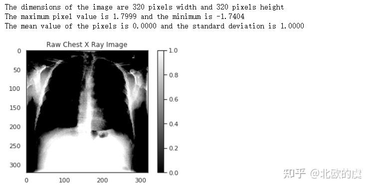
图像被转换为了一个标准正态分布的图像。
接下来我们再可视化一下这个标准正态分布的像素点与之前的原始图像,在分布上有什么不同:
sns.set()
plt.figure(figsize=(10, 7))

sns.distplot(raw_image.ravel(),
             label=f'Original Image: mean {np.mean(raw_image):.4f} - Standard Deviation {np.std(raw_image):.4f} \n '
             f'Min pixel value {np.min(raw_image):.4} - Max pixel value {np.max(raw_image):.4}',
             color='blue',
             kde=False)

sns.distplot(generated_image[0].ravel(),
             label=f'Generated Image: mean {np.mean(generated_image[0]):.4f} - Standard Deviation {np.std(generated_image[0]):.4f} \n'
             f'Min pixel value {np.min(generated_image[0]):.4} - Max pixel value {np.max(generated_image[0]):.4}',
             color='red',
             kde=False)

plt.legend()
plt.title('Distribution of Pixel Intensities in the Image')
plt.xlabel('Pixel Intensity')
plt.ylabel('# Pixel')
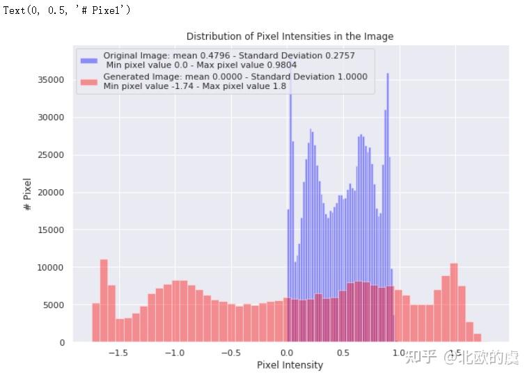
我们可以看到标准化后的像素分布,比起原始图像要平滑很多(蓝色为原始,红色为标准化后的分布),这有利于我们的模型训练。